
The Tri7 name is derived from the three partners and the number seven, representing good luck and fortune in Hebrew.
Our challenge was to redefine this Real Estate brand, evoking a new sense of energy, encapsulating it’s evolution.
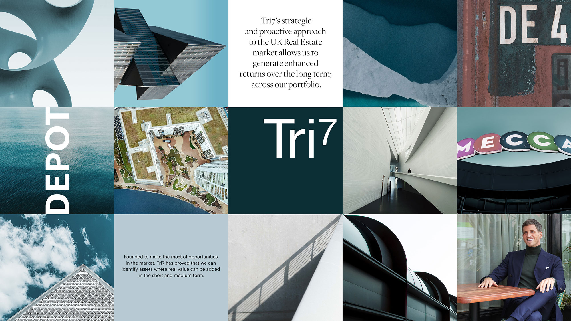
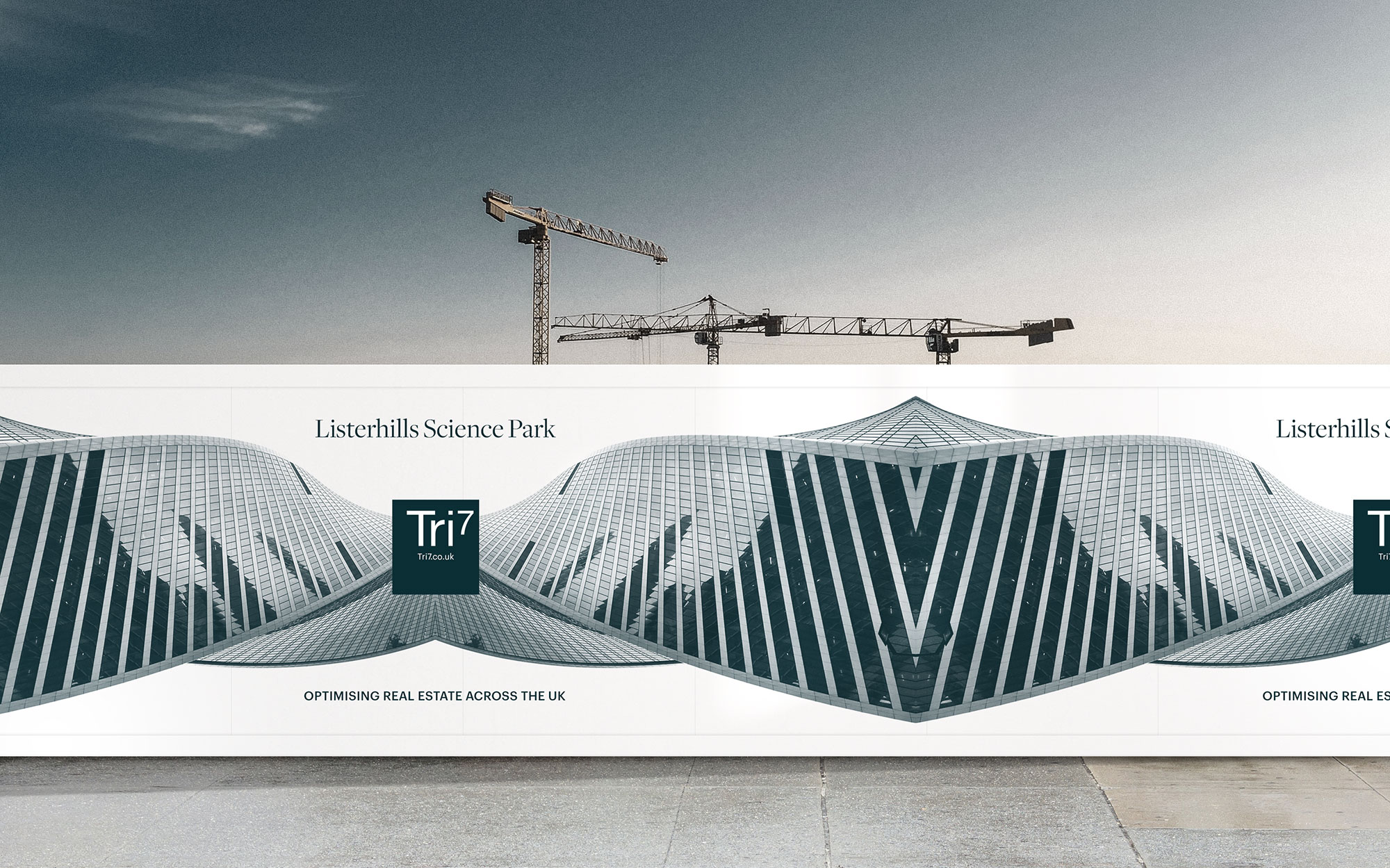
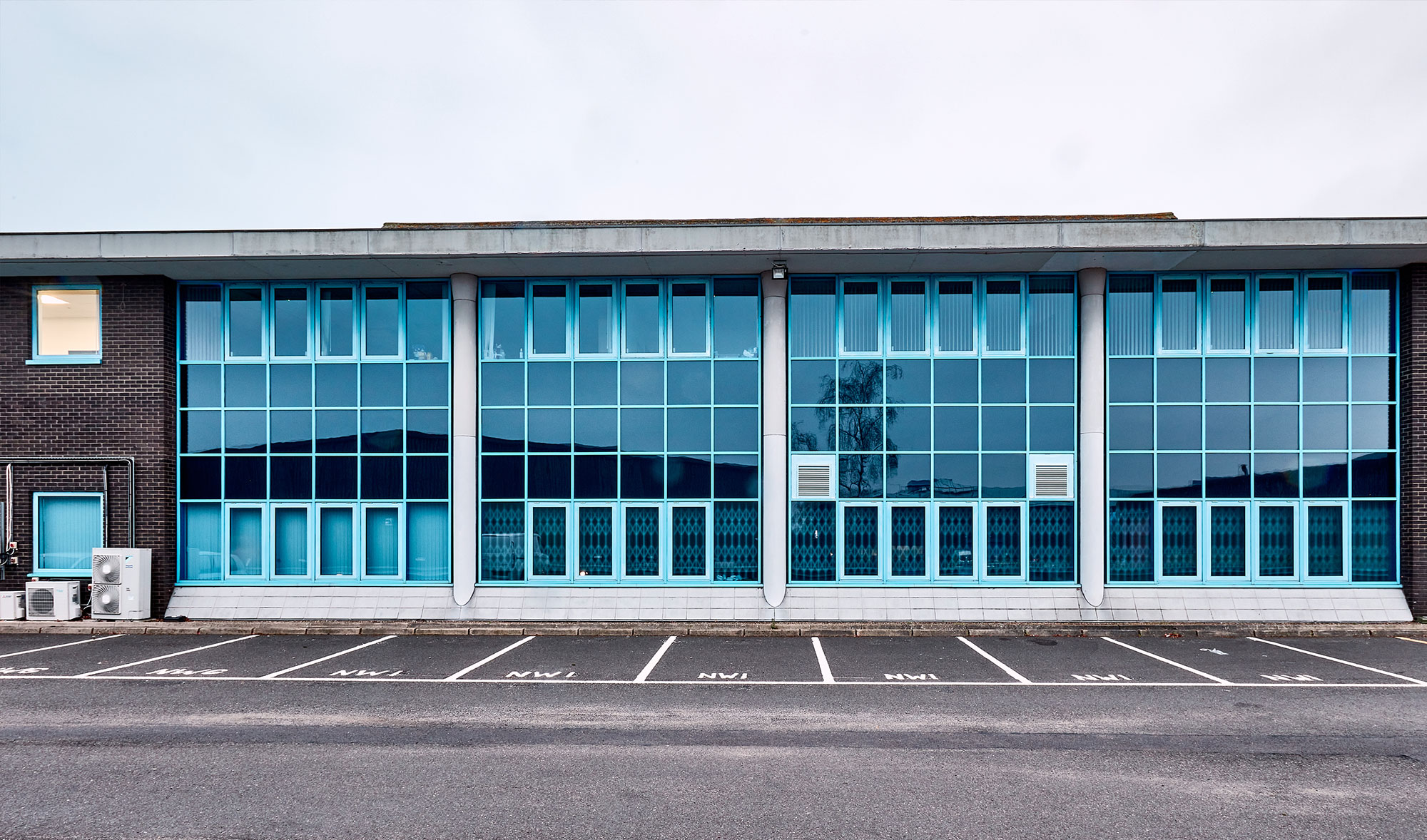
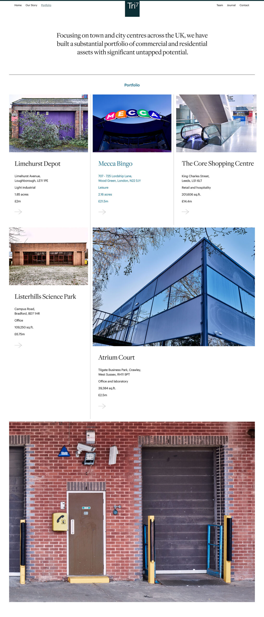
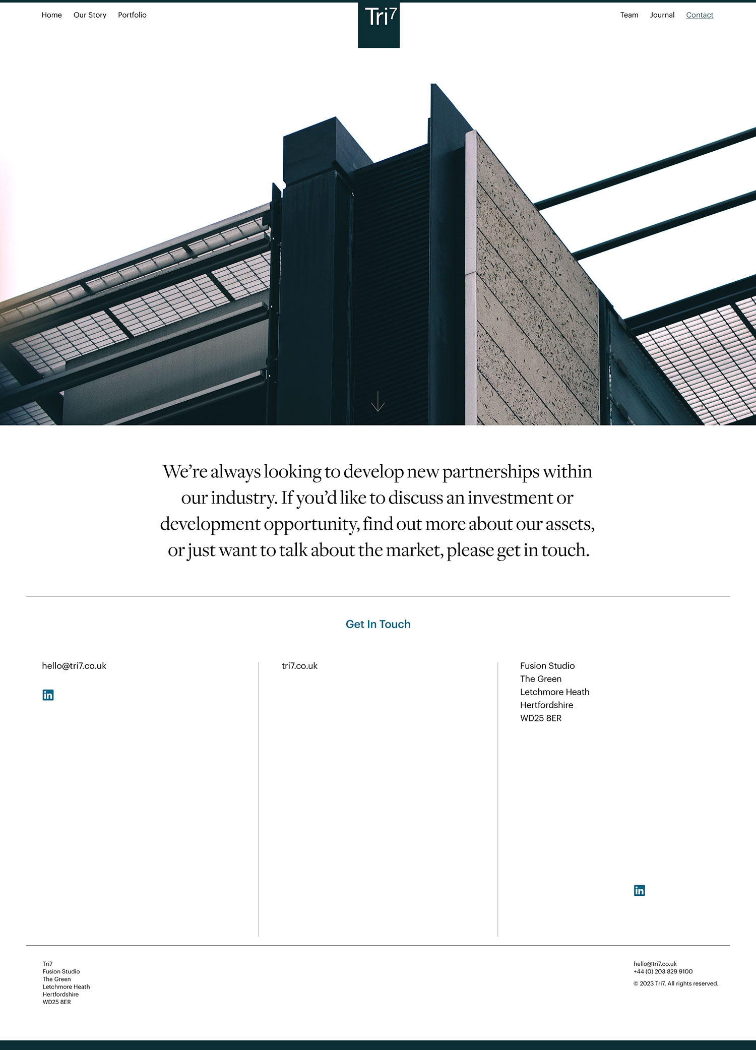
Abstract crops and photo montages of urban and rural landscapes make up the creative library. The use of a dark turquoise blue, further reflects the message of good fortune and hope. The pure typographical style nods towards the more corporate side of the brand, neatly pulling together the abstract imagery.
Client: Tri7


© 2026 Teller Creative. All rights reserved.
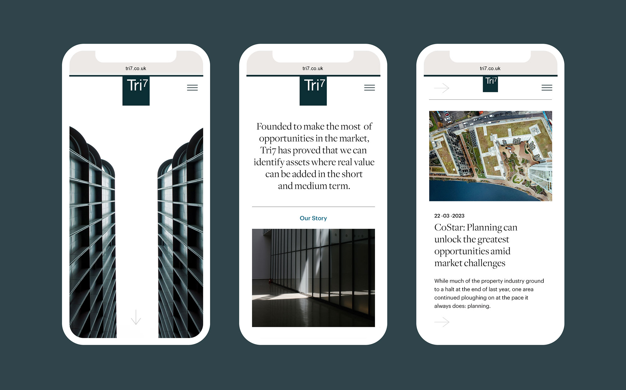
Website design by ACRE
Website design by ACRE
© 2026 Teller Creative. All rights reserved.
