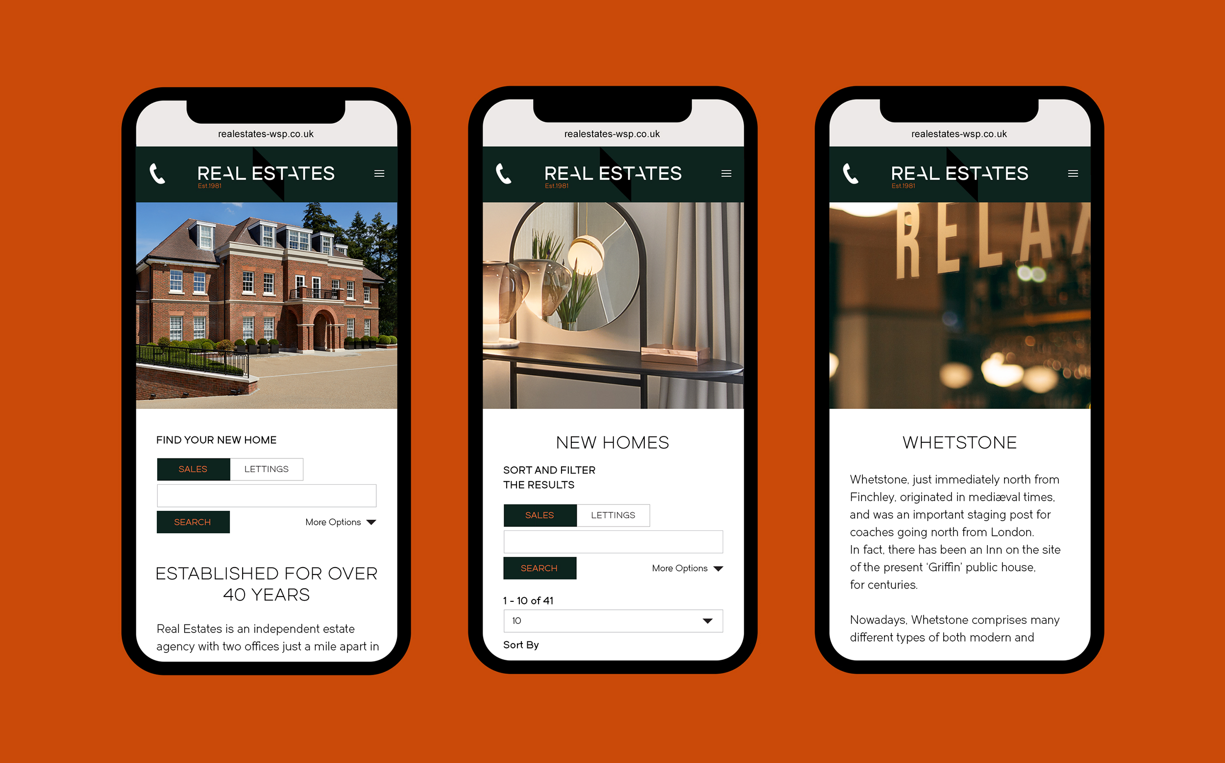
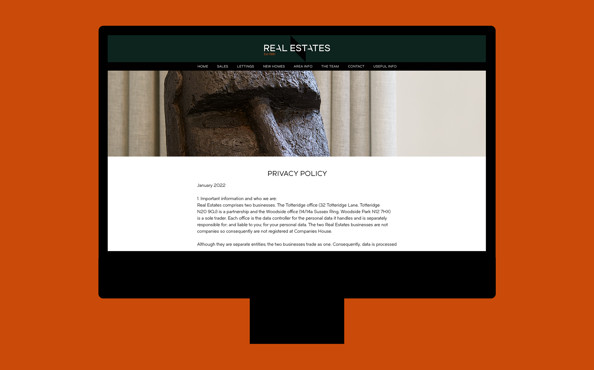
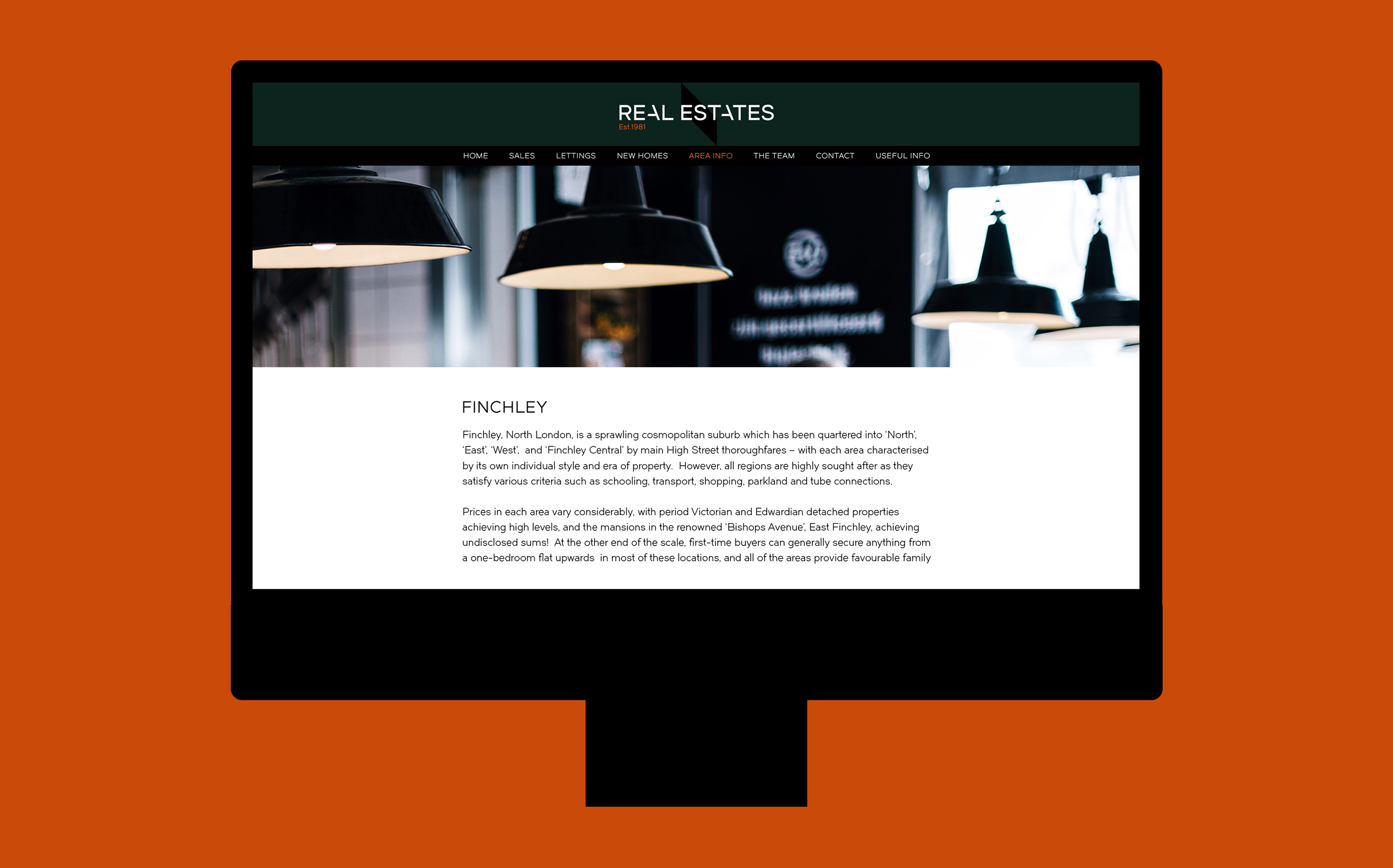
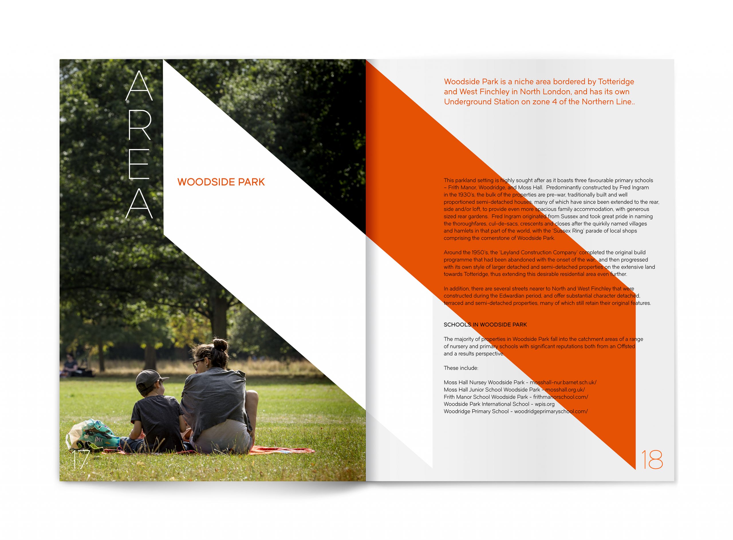
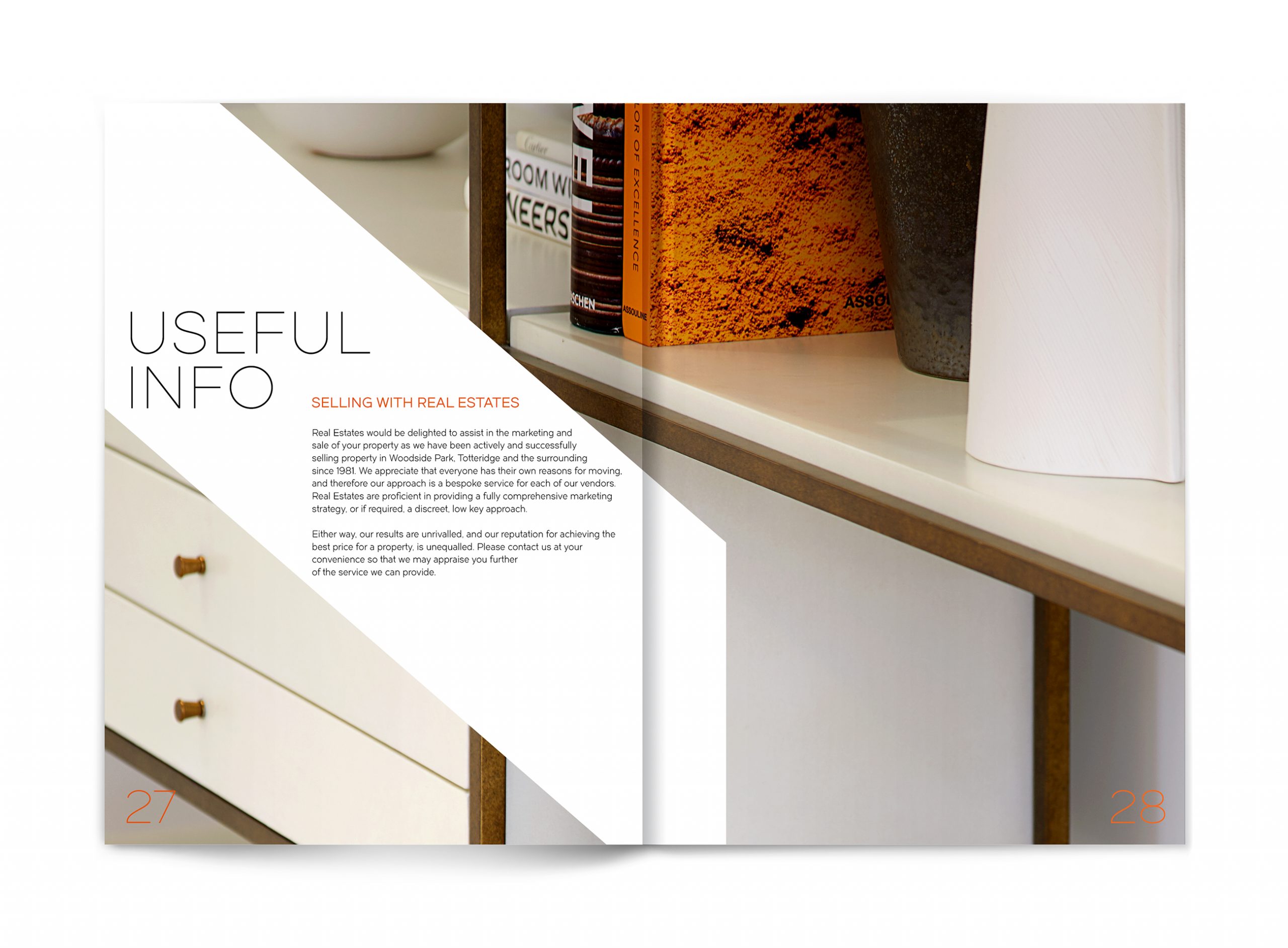
Building this north London brand for more than four decades, Real Estates commissioned us to undergo a full brand refresh, redefining their future legacy. Keeping sympathetic to its tradition whilst creating a new forward thinking attitude.
We introduced a clean sans serif logotype to set the style creating a new contemporary visual language, simplifying the existing ‘double chevron’ brand mark into a more recognisable and striking symbol. The use of a dark racing green evokes a sense of tradition and stability, a nod to its past, juxtaposed with a tinge of orange bringing a new sense of energy and expression.
A confidently timed roll out from website, stationery, sale boards to both Woodside Park and Totteridge offices undergoing internal and external fit outs, set the stage for Real Estates next chapter.
Client: Real Estates


