
After some honest conversations with the Directors, we agreed a fresh new direction was needed to suite GLPG’s next chapter and align the new sectors of the business.
We started with foundations.
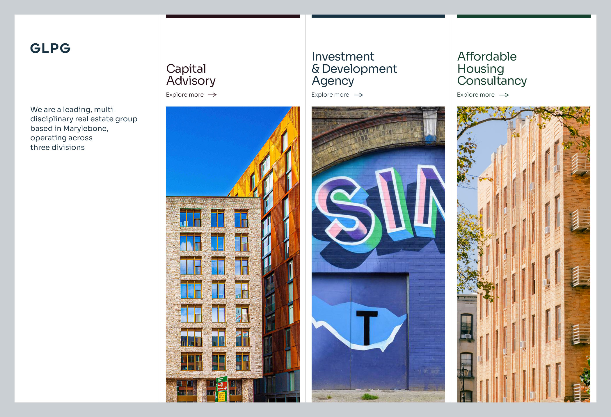
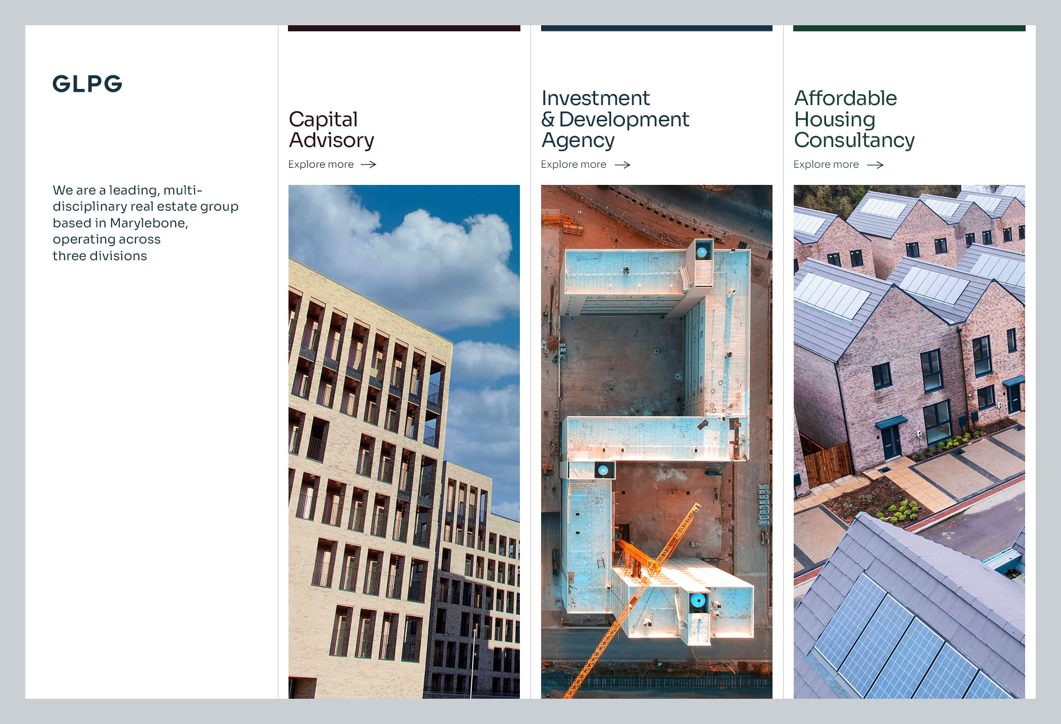
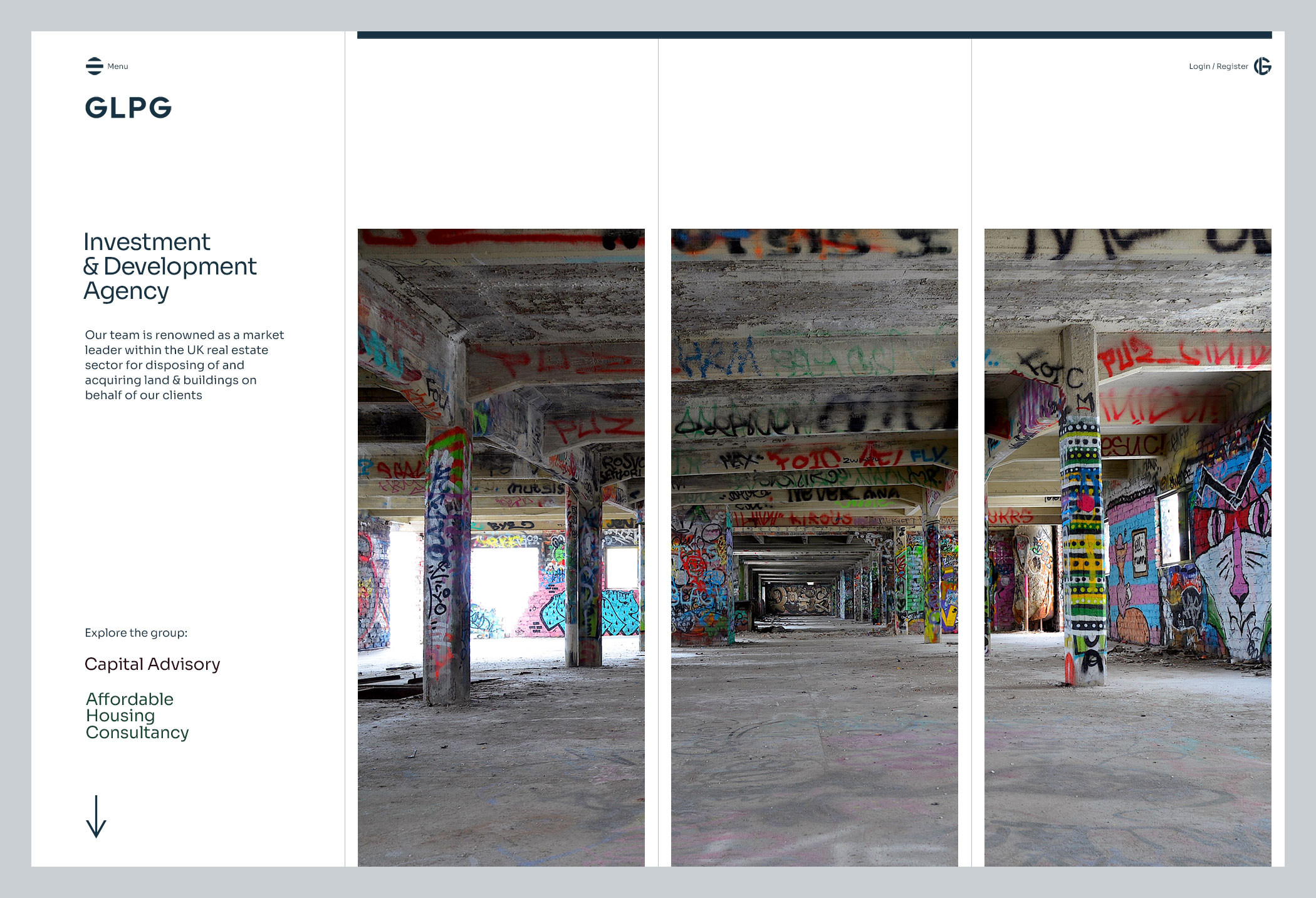
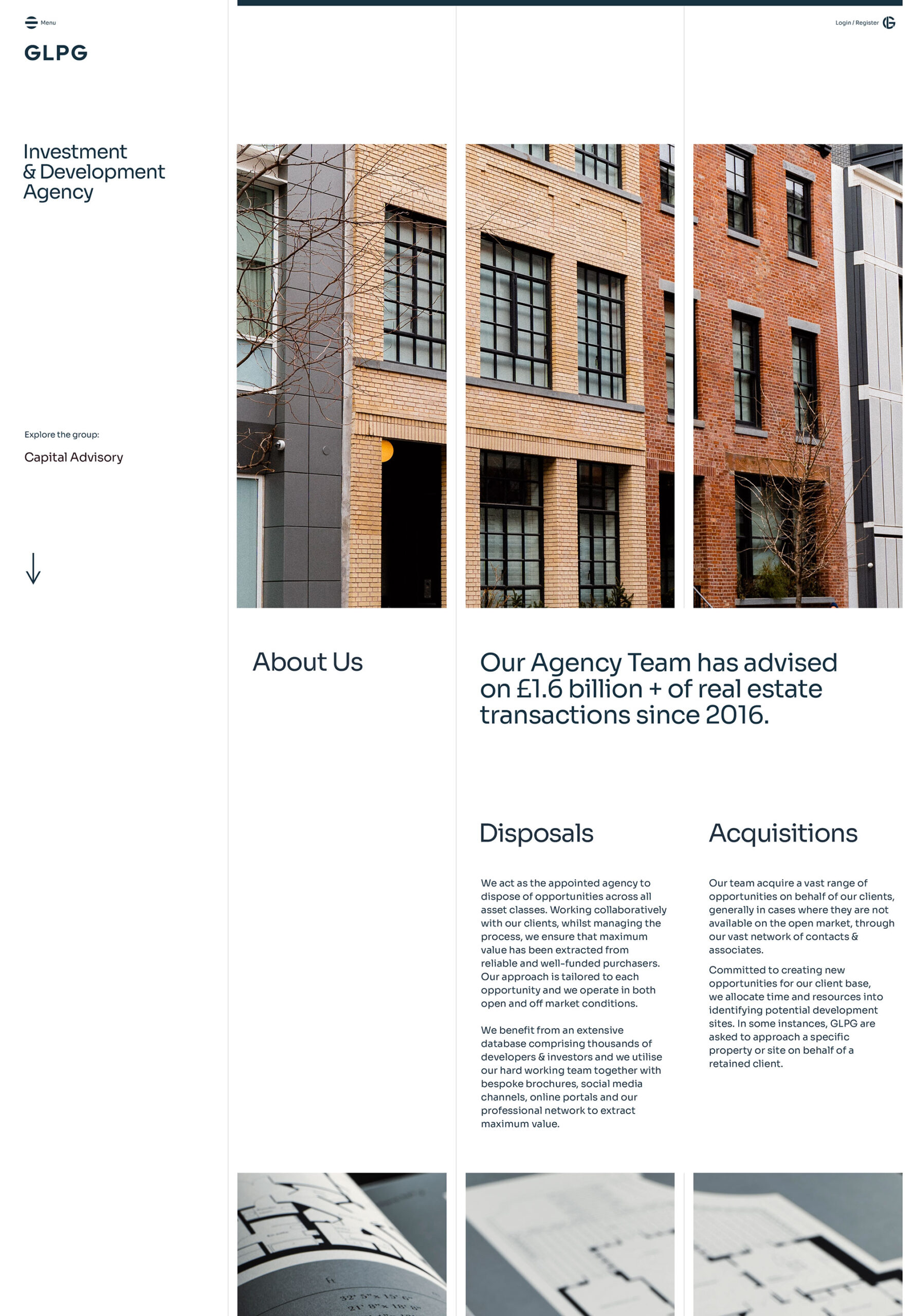
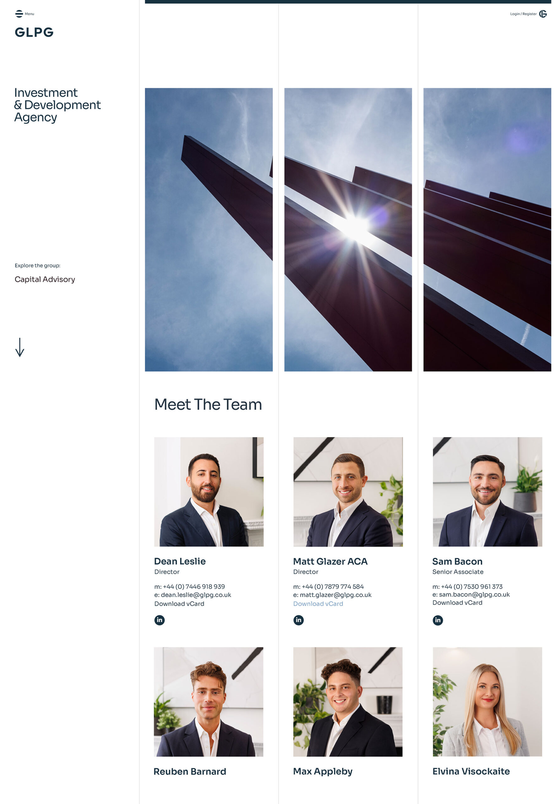
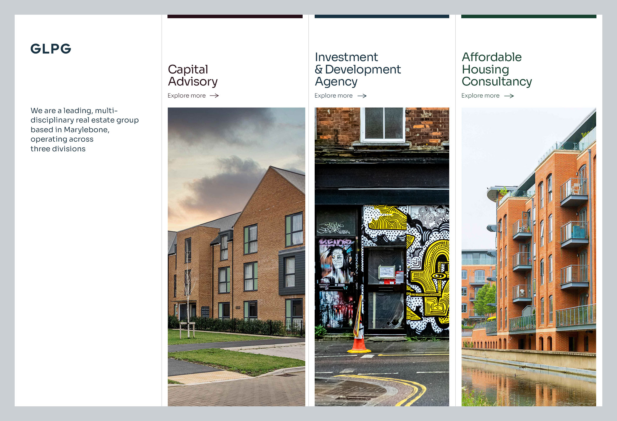
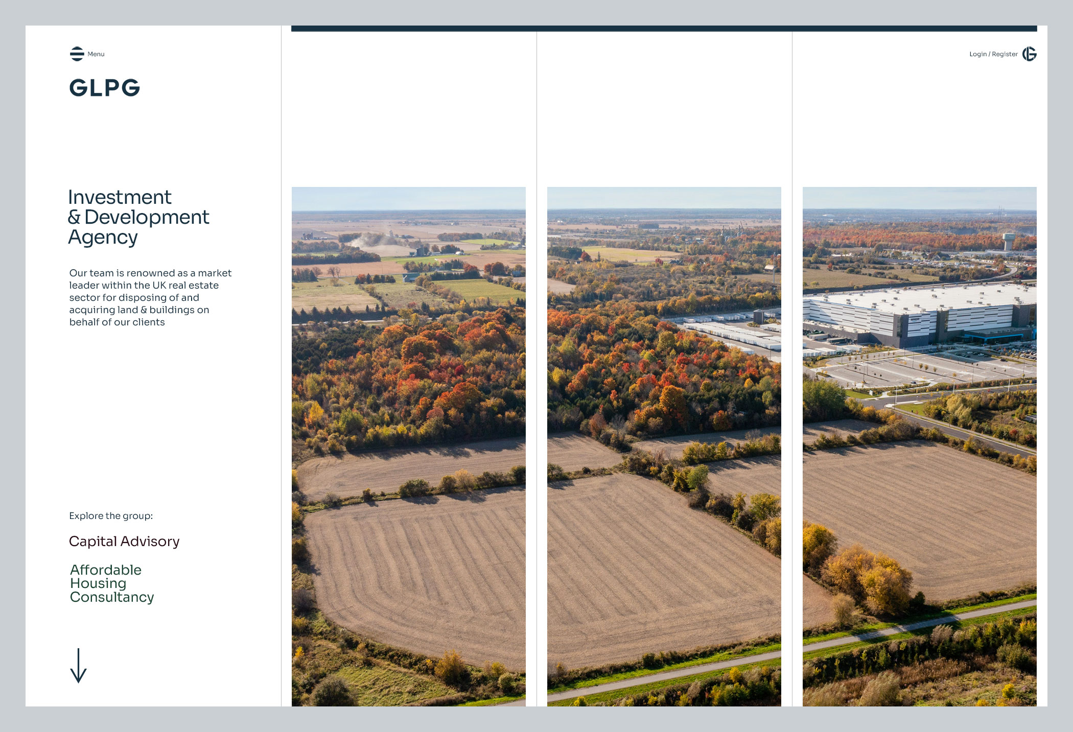
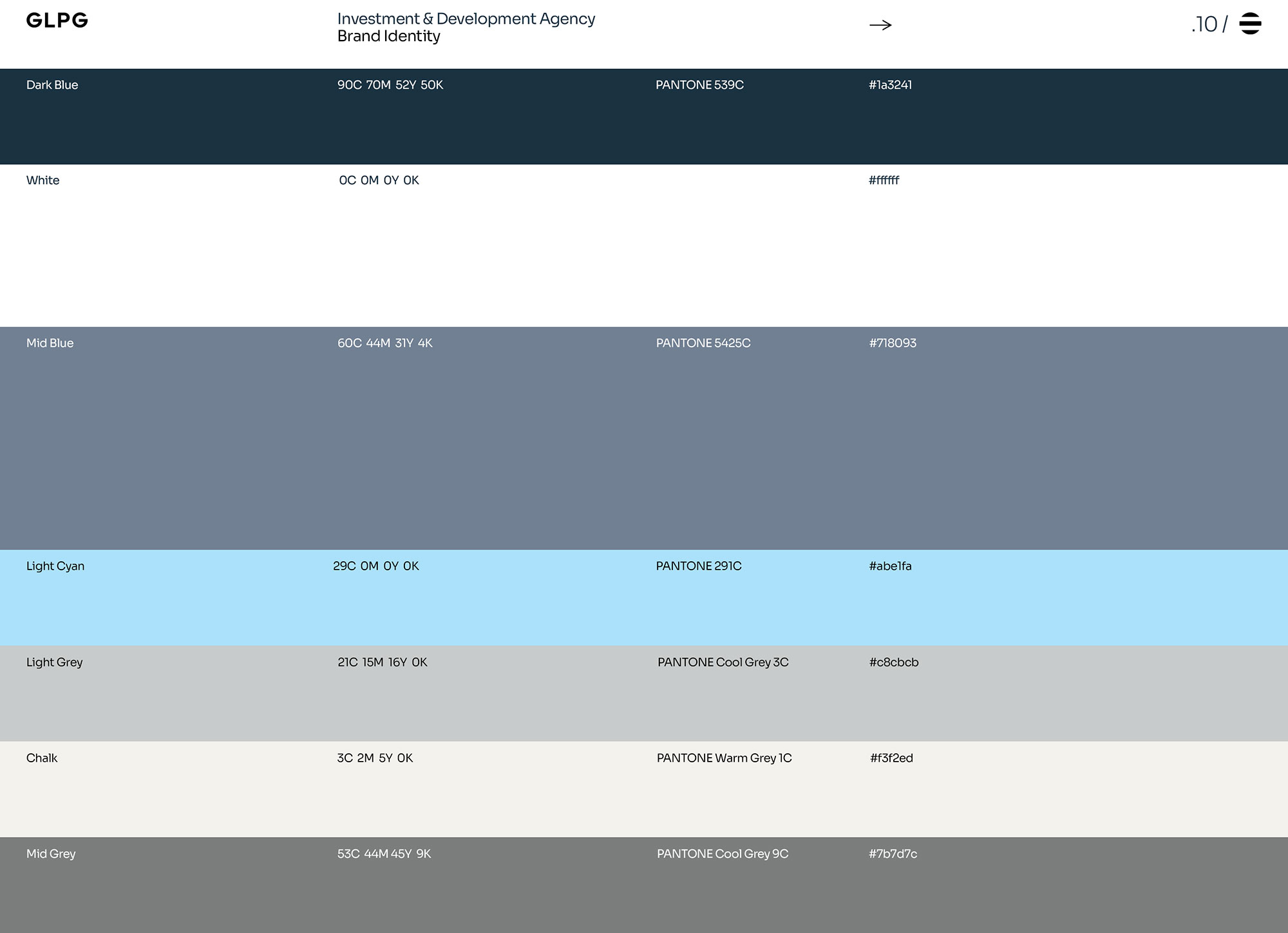
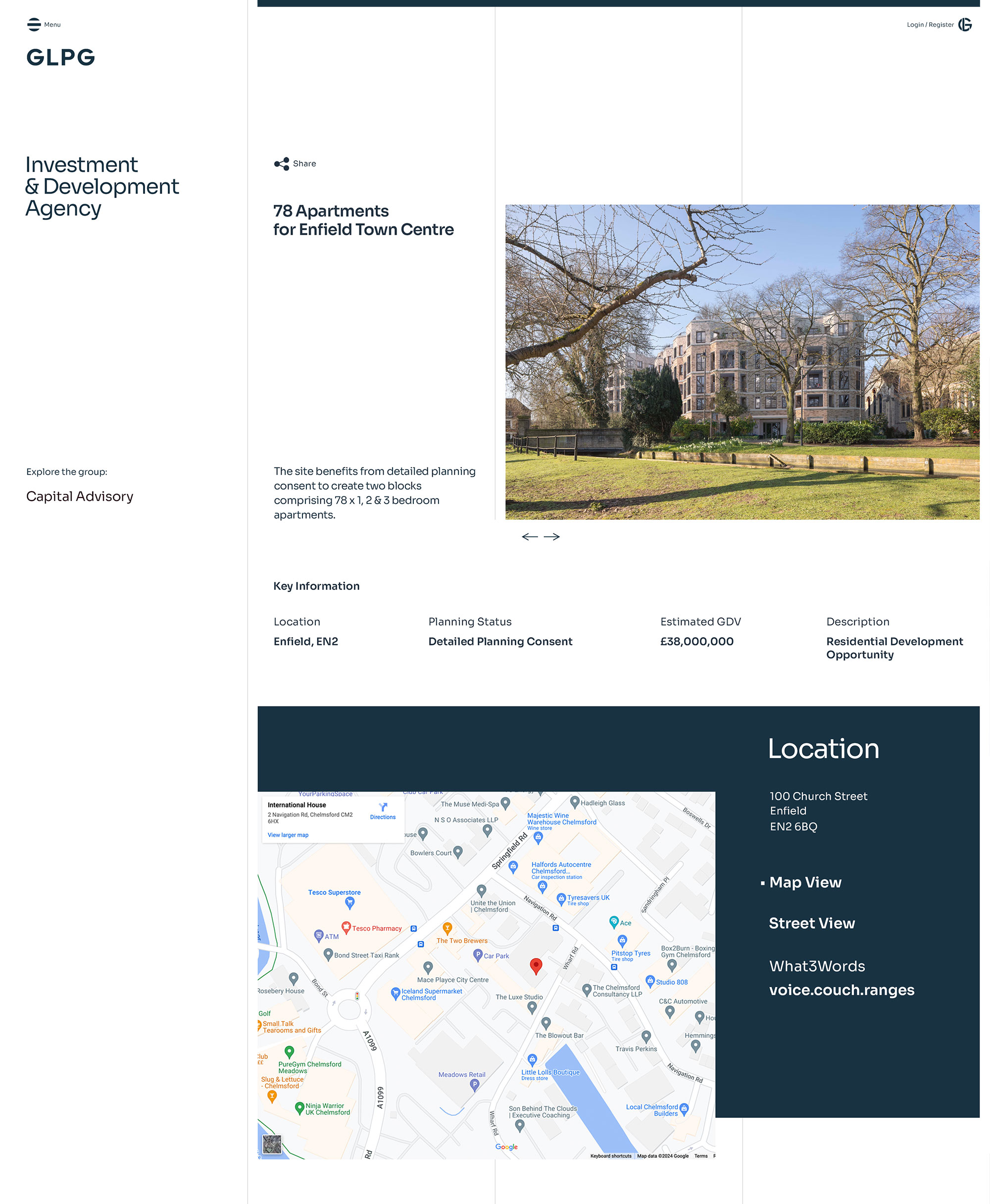
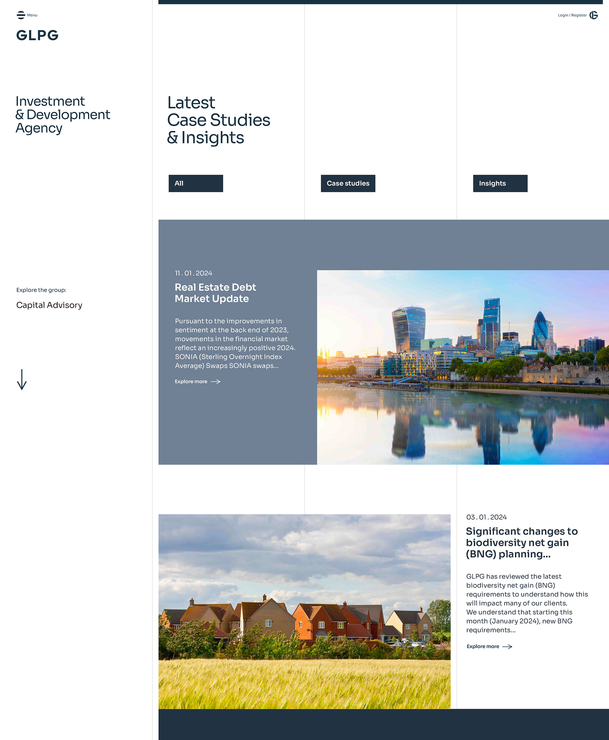
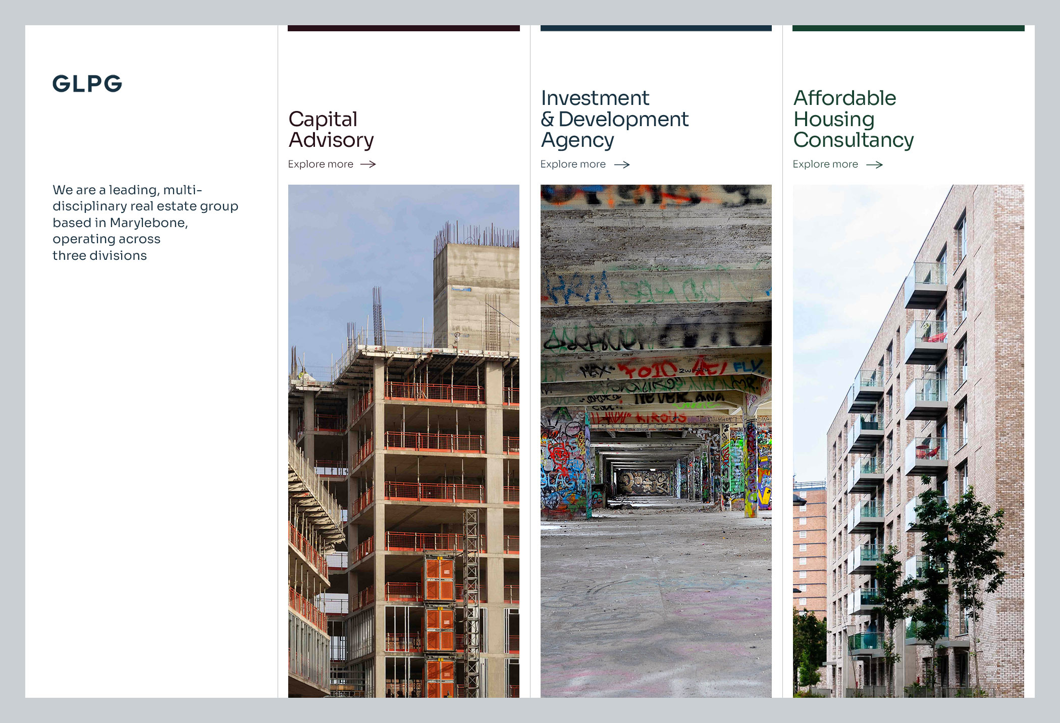
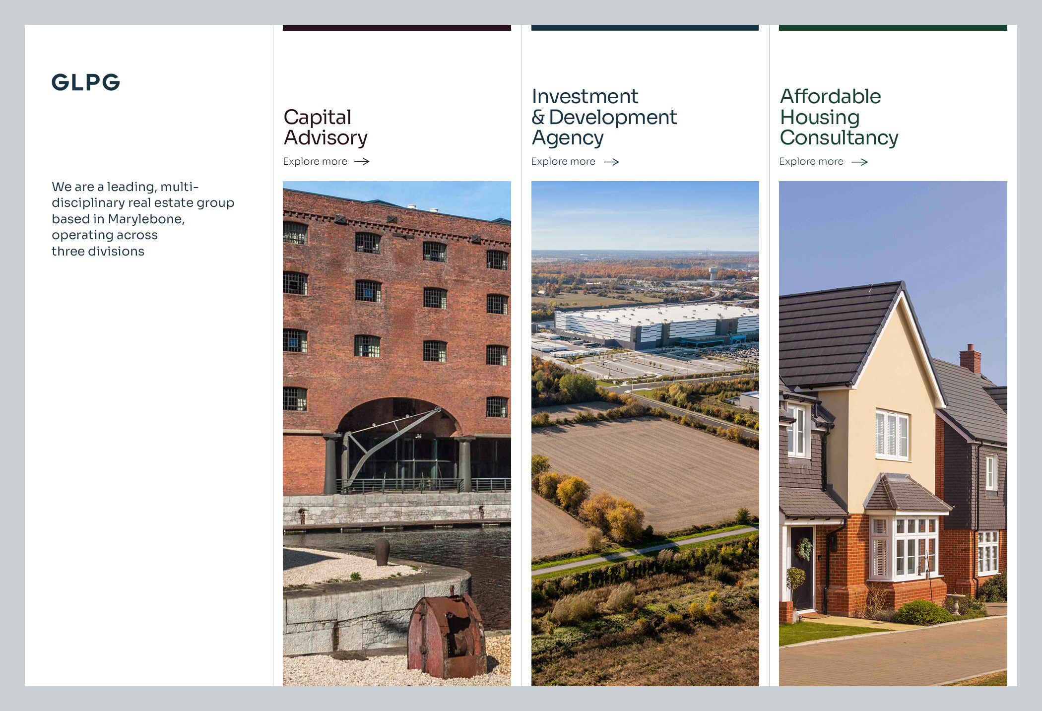
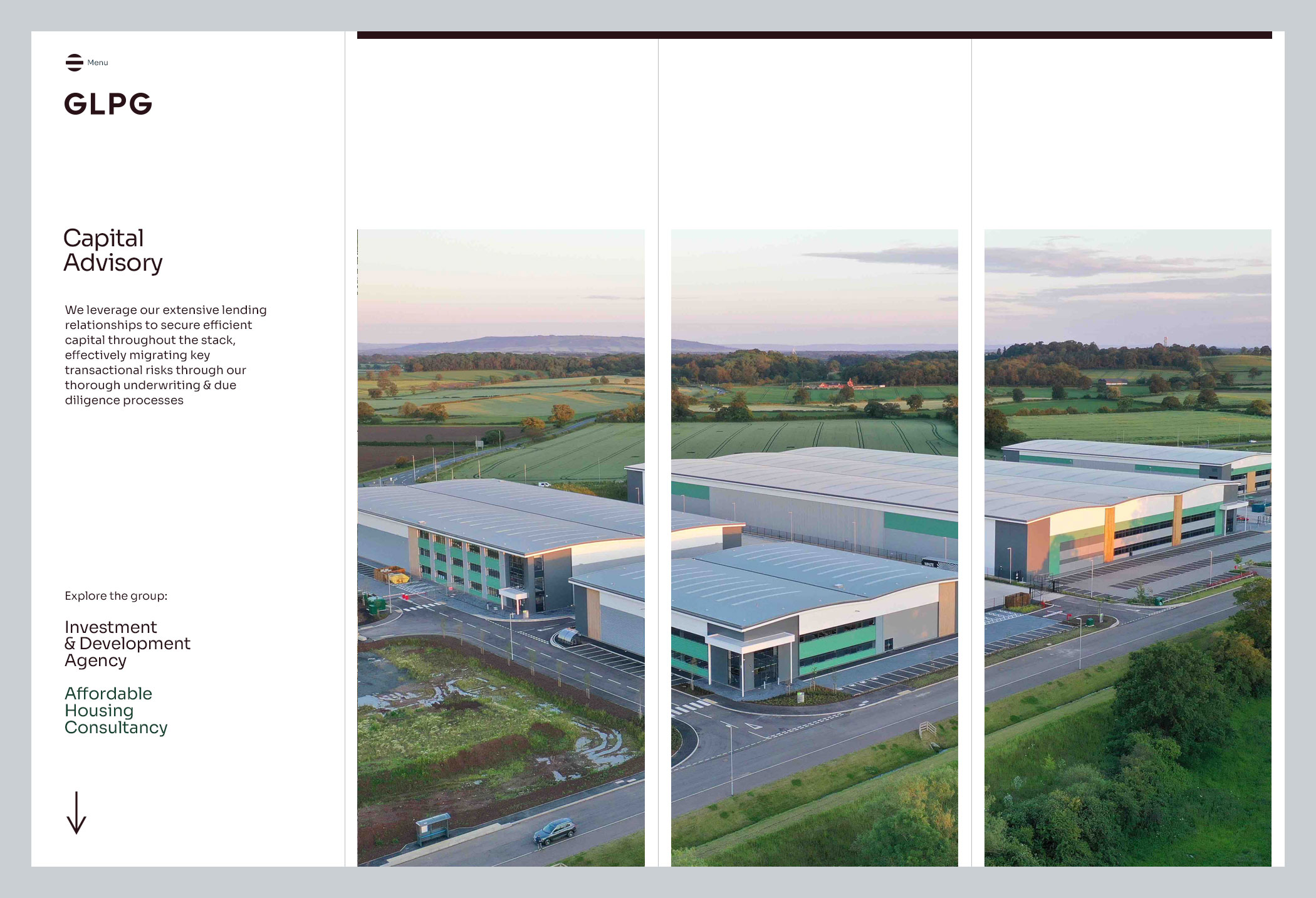
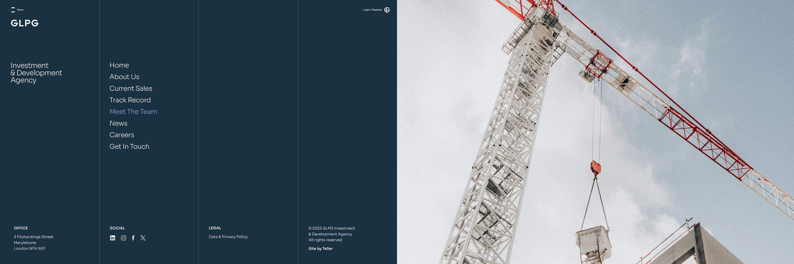
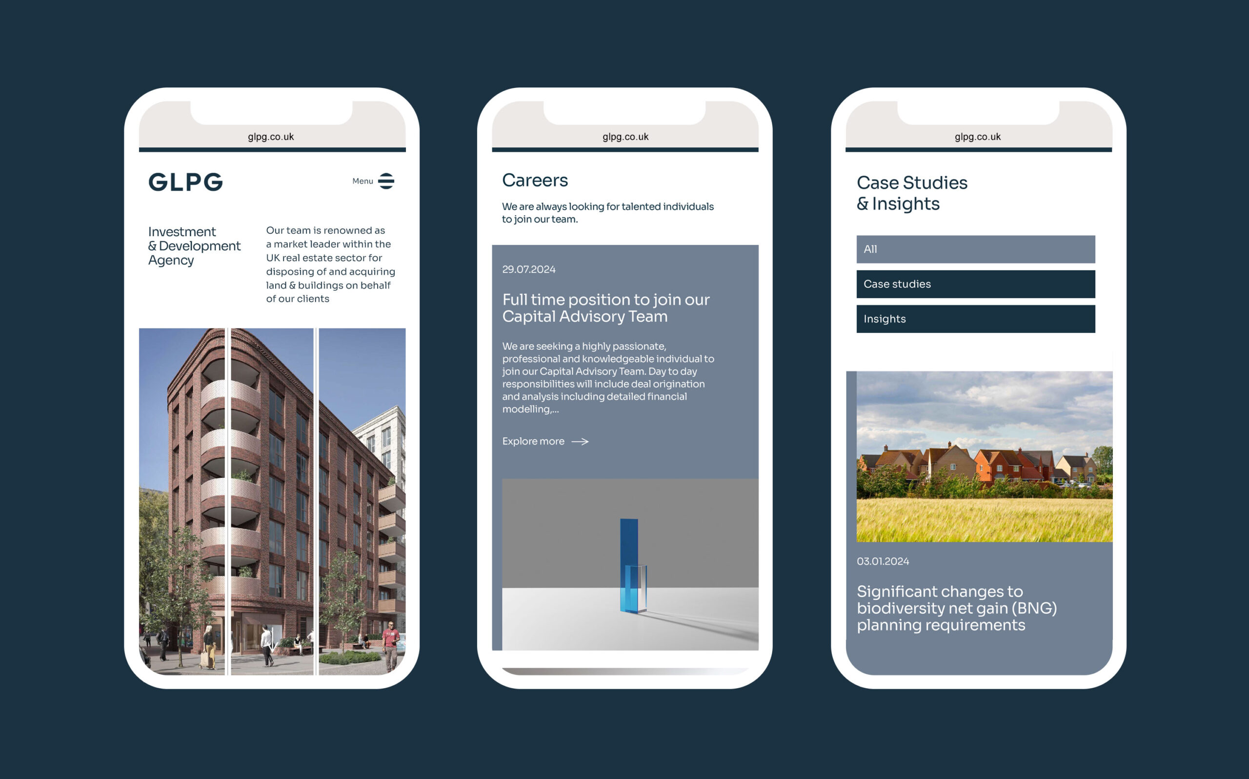
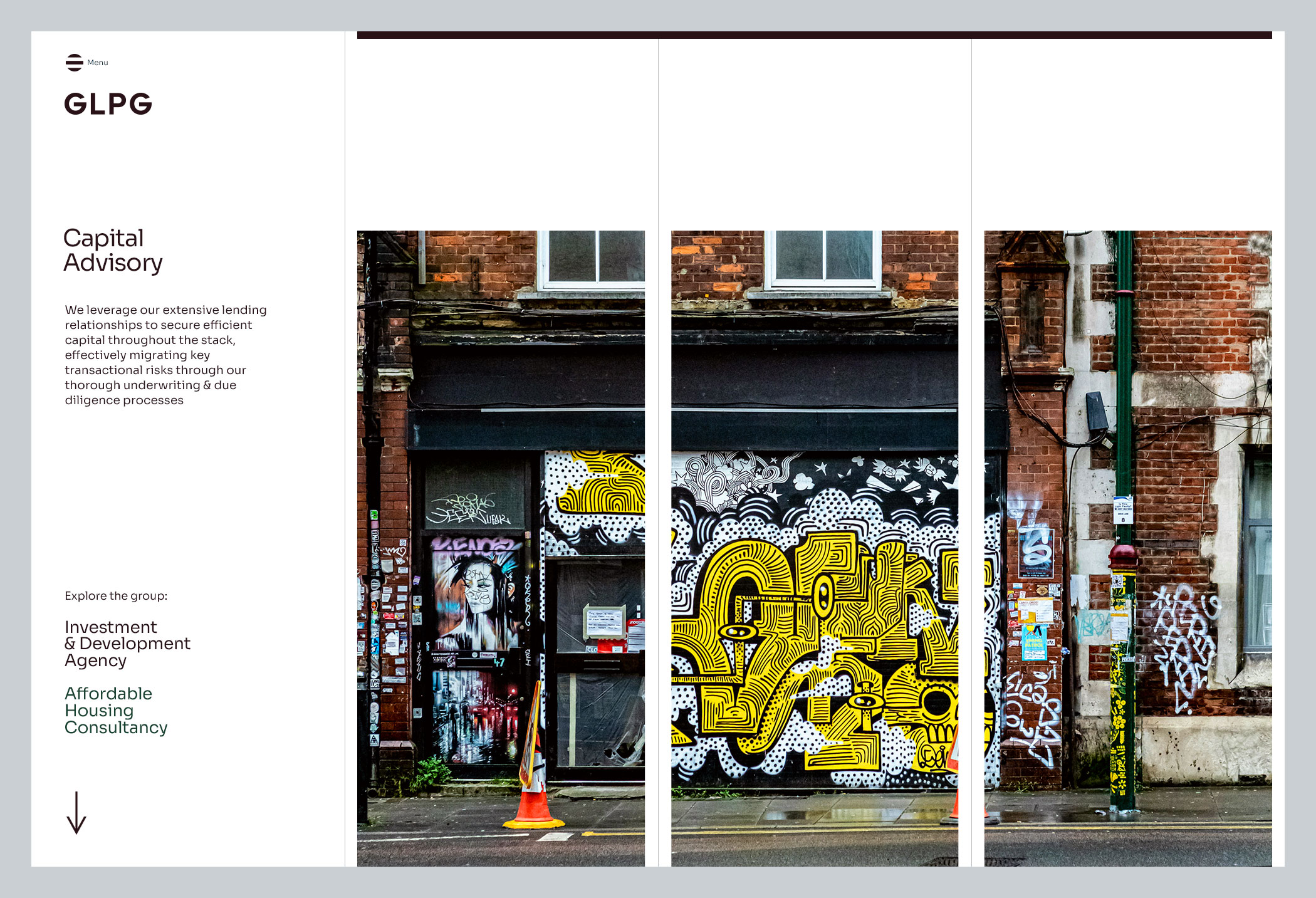
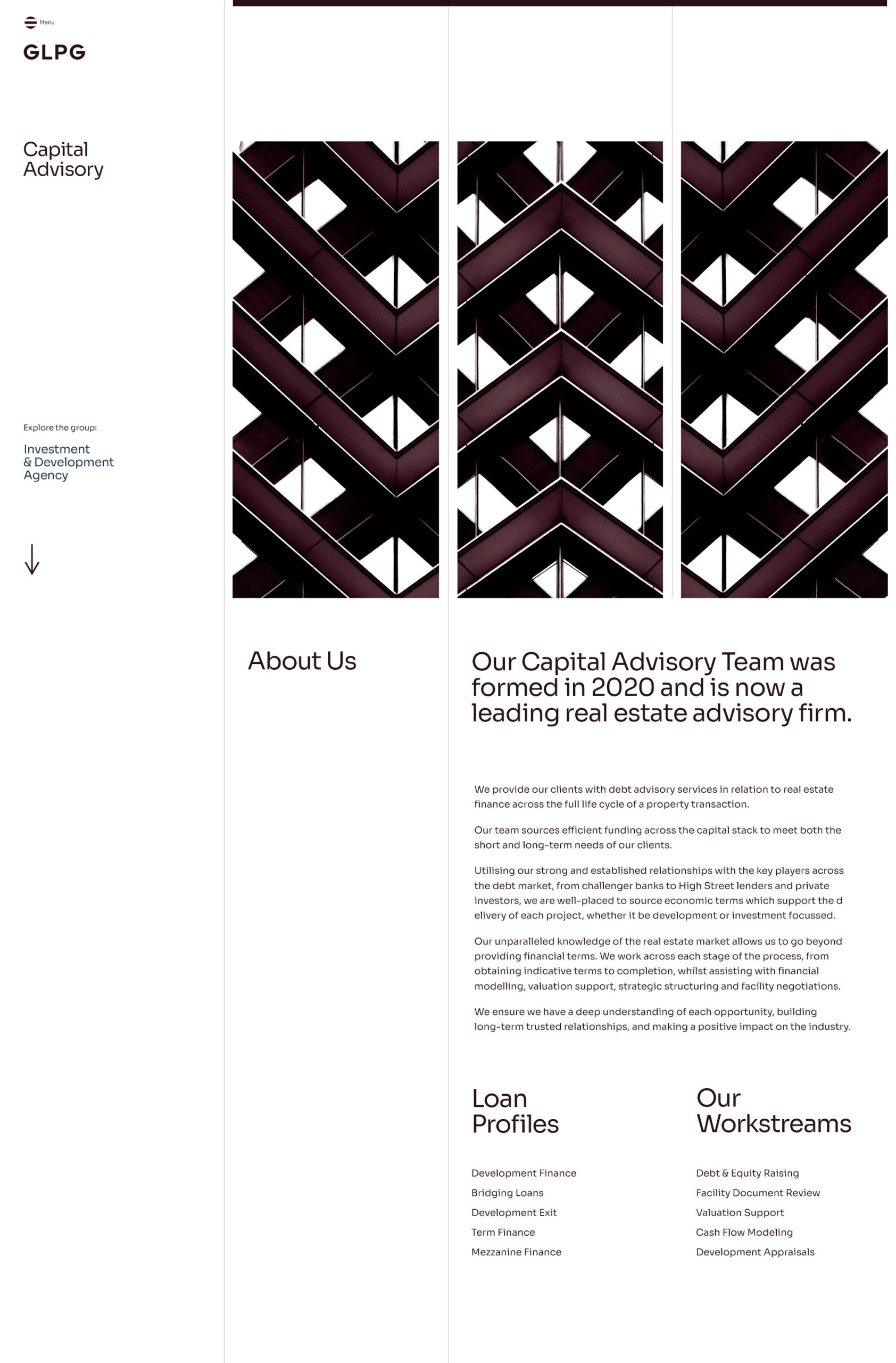
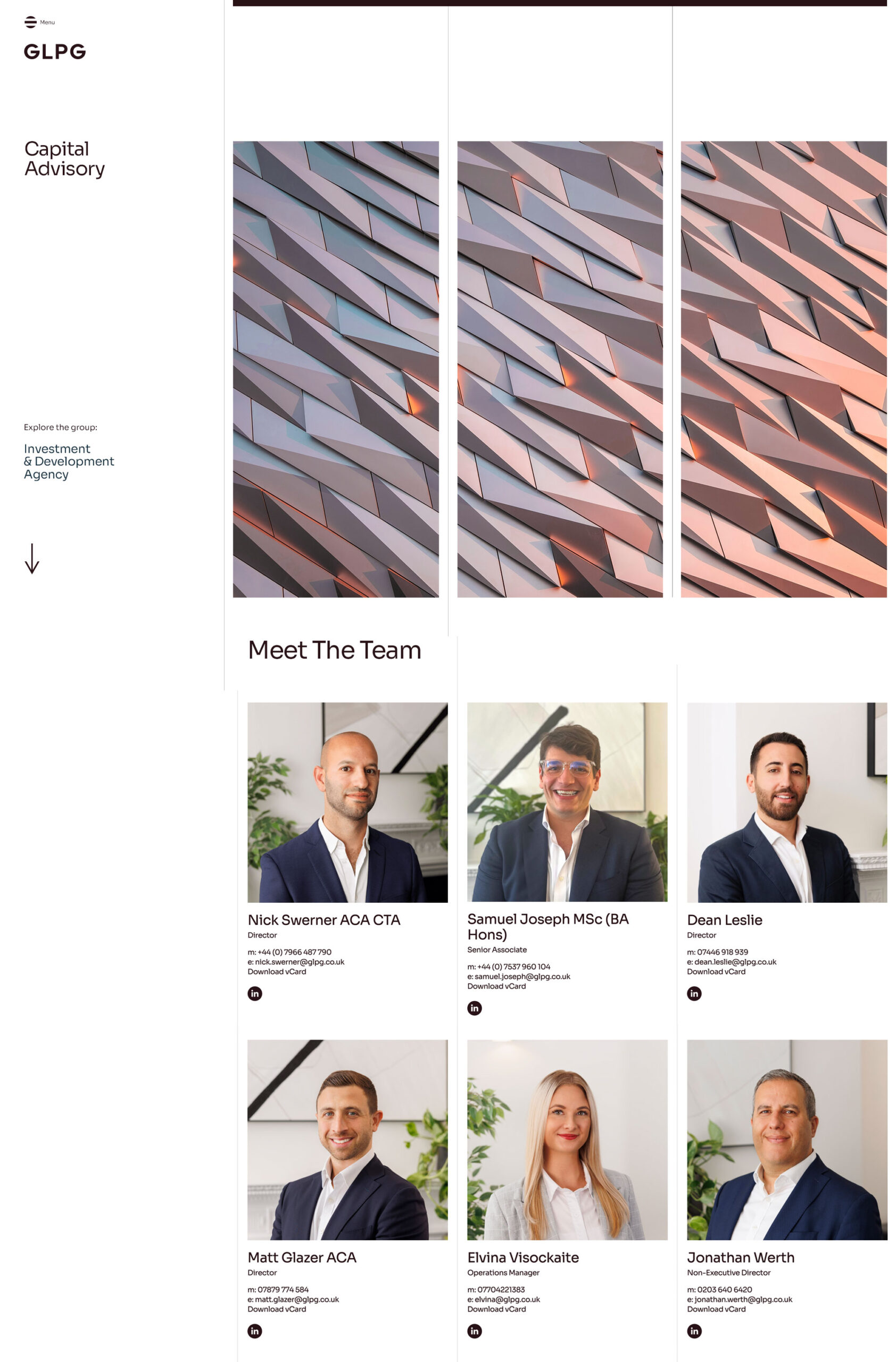
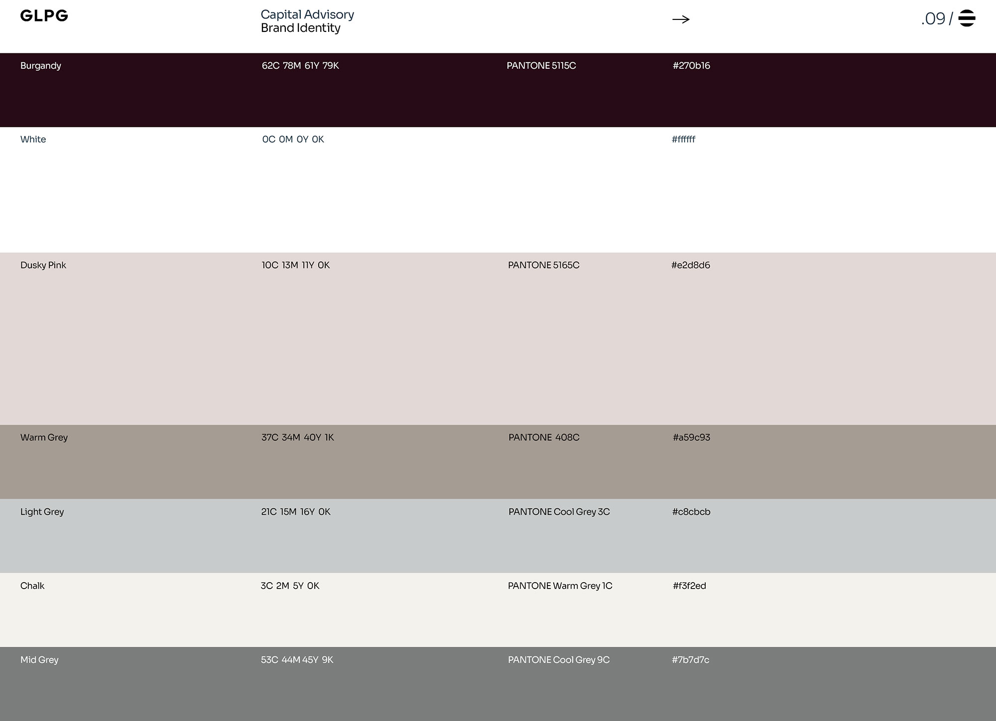
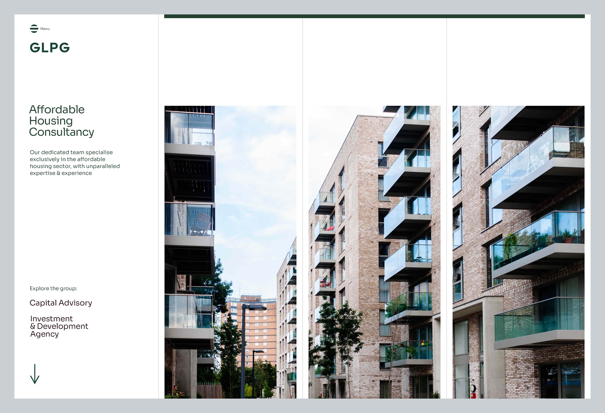
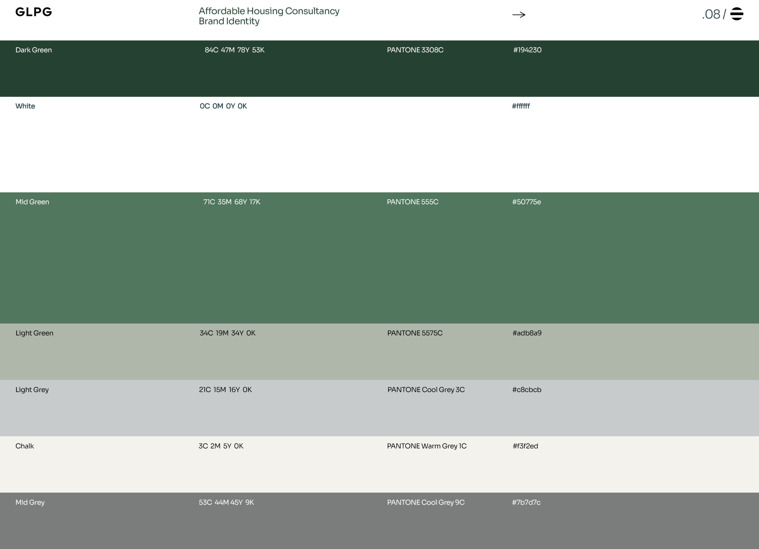
Reimagining their logotype and colour palette set the tone for the visuals and we were able to create alignment on how the site should look and feel. But this wasn’t just about aesthetics. GLPG is split into three key divisions – Capital Advisory, Investment & Development Agency and Affordable Housing Consultancy – this applied to our website and added an extra level of scope regarding the navigation and functionality.
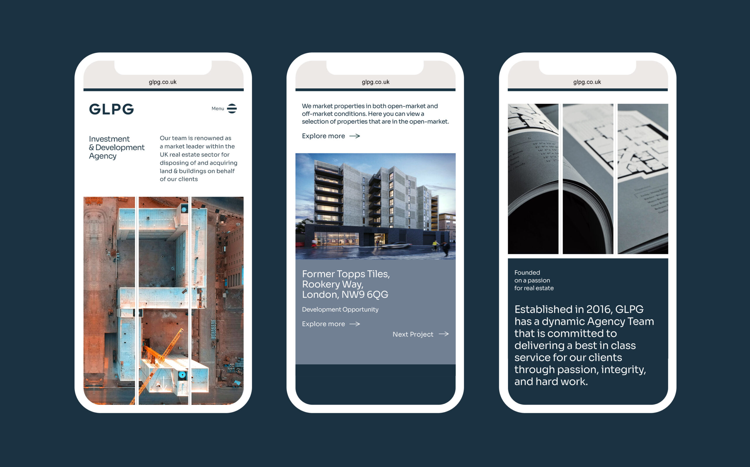
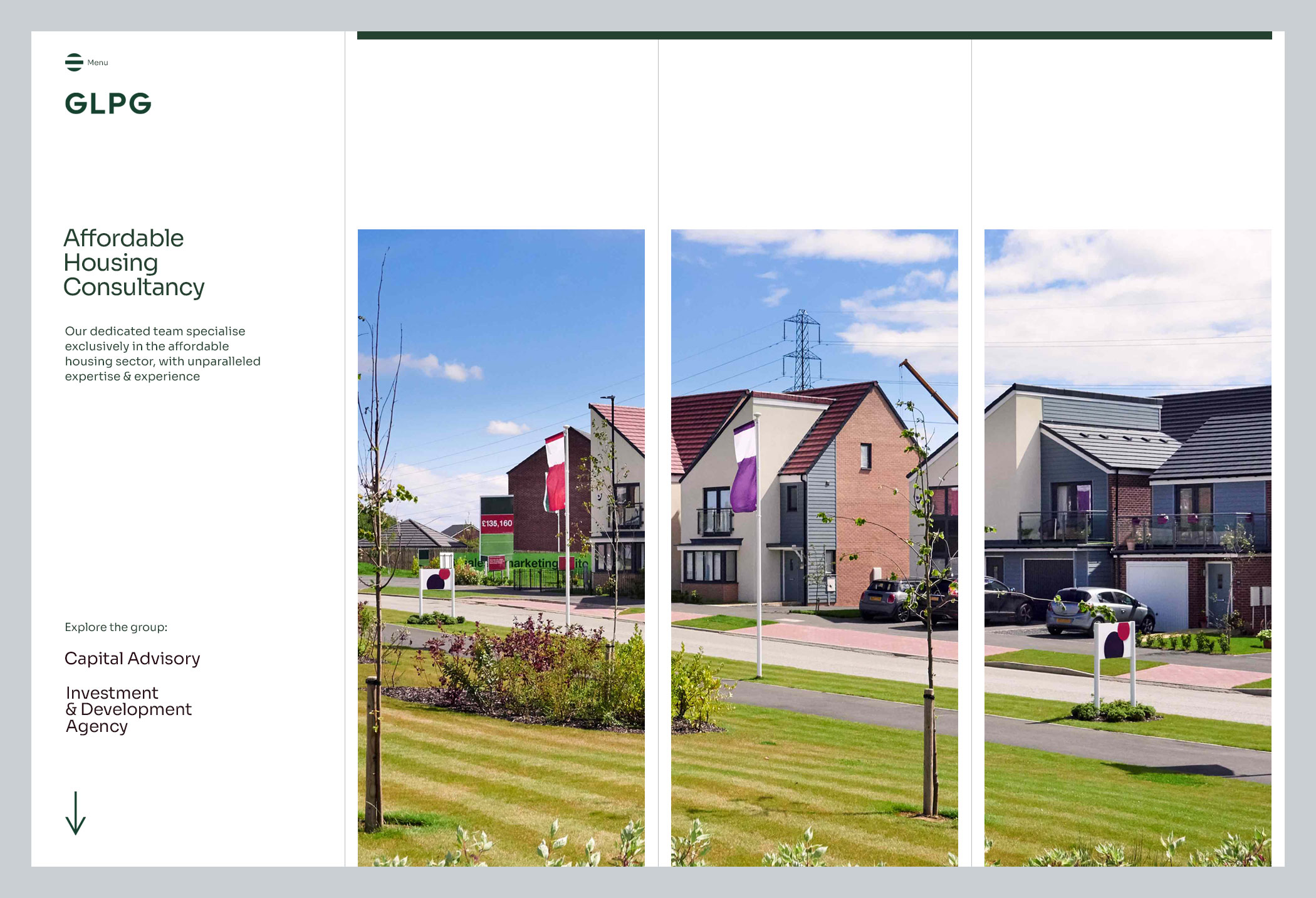
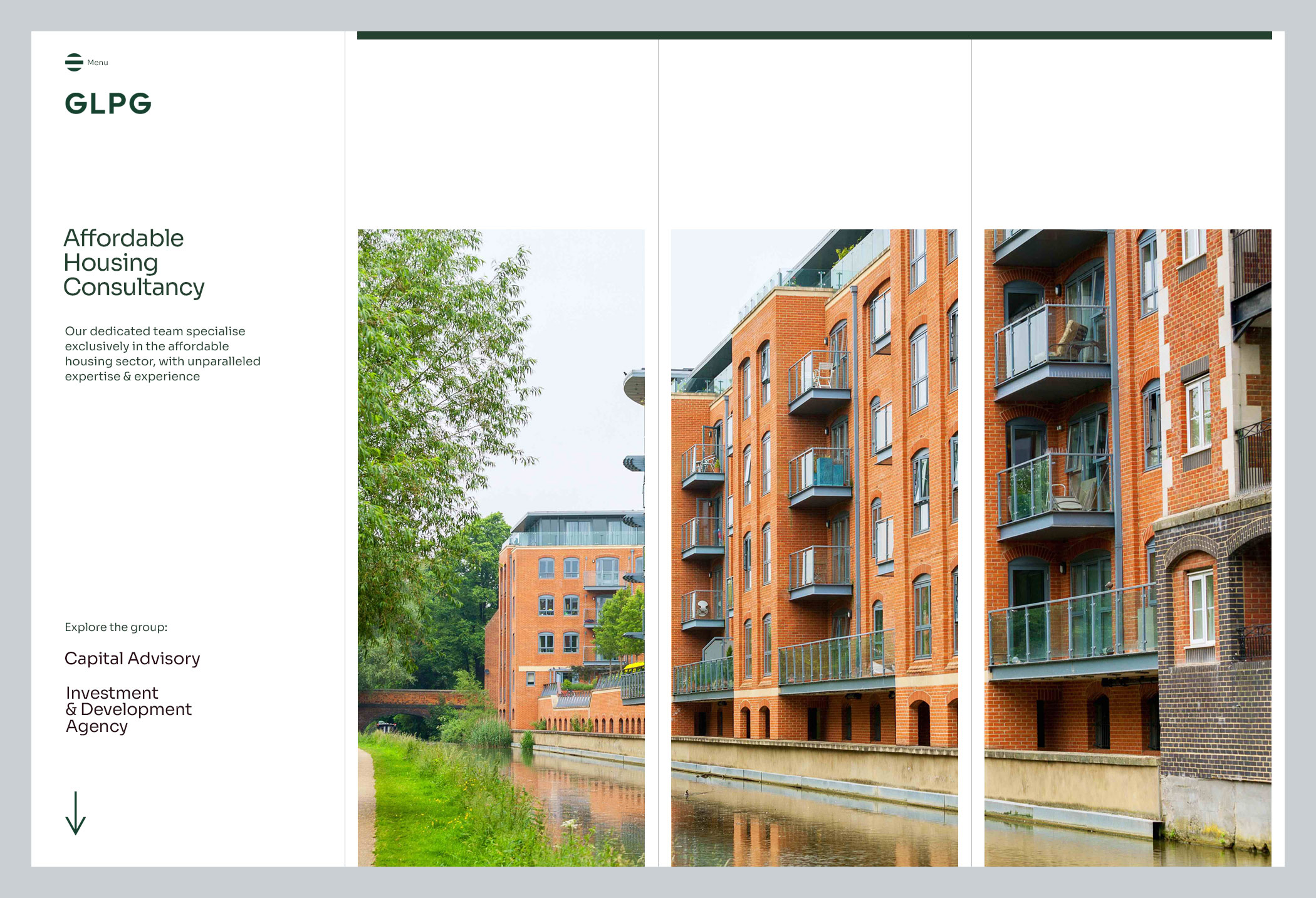
The project required a more refined and specific approach in respect to the imagery, to visually represent the brand and to hone in on the type of property sectors they deal with.
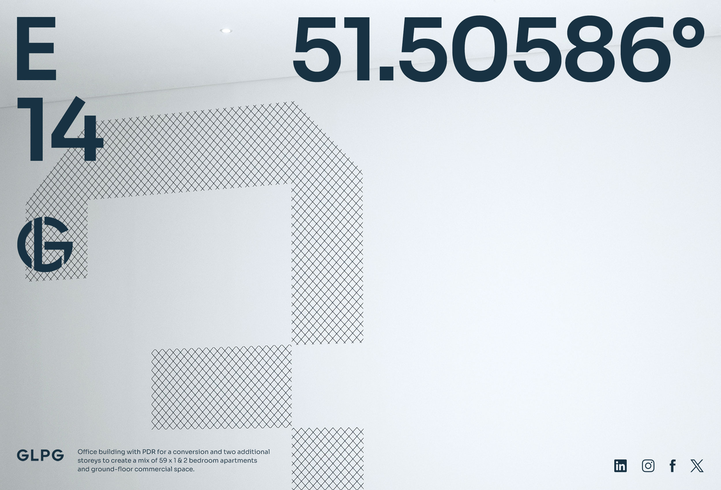
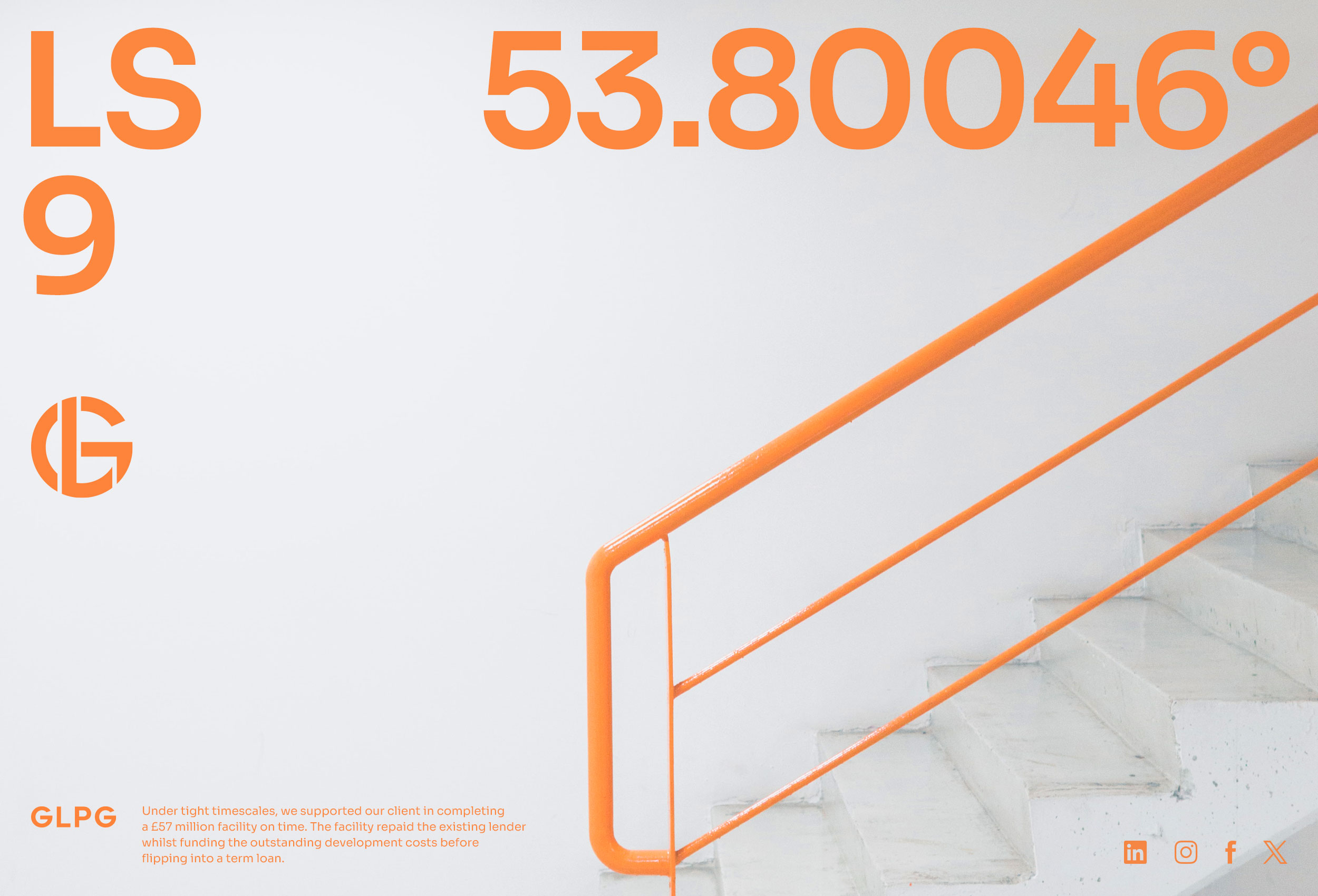
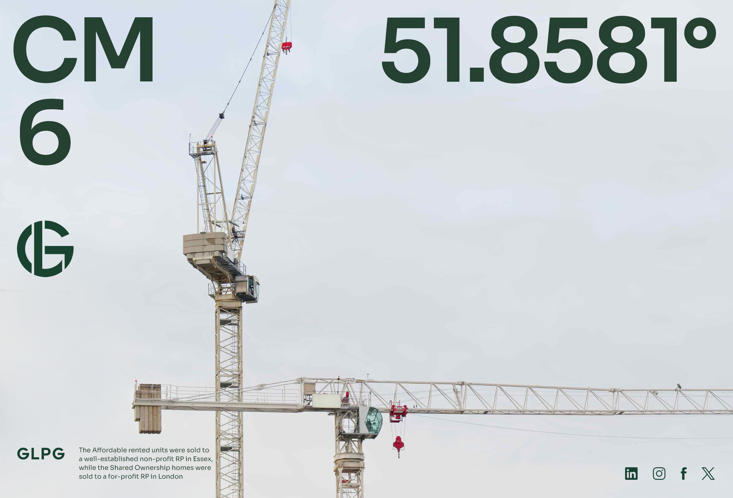
A clean, bold typographical style was established, to be rolled out on all of GLPG’s marketing collateral, keeping it consistent across all platforms.
Client: GLPG


© 2026 Teller Creative. All rights reserved.
Website design by ACRE
Website design by ACRE
© 2026 Teller Creative. All rights reserved.
