
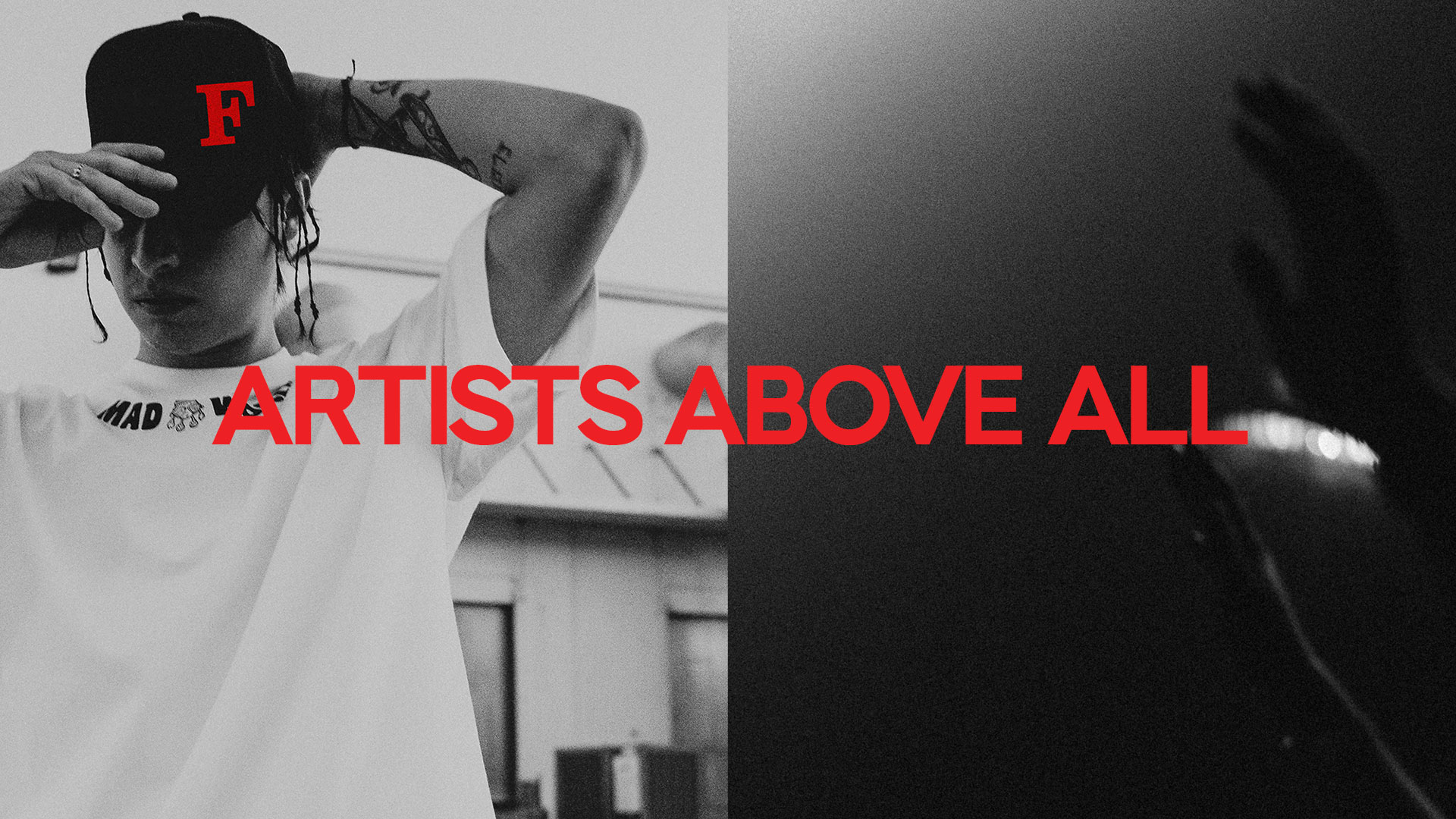
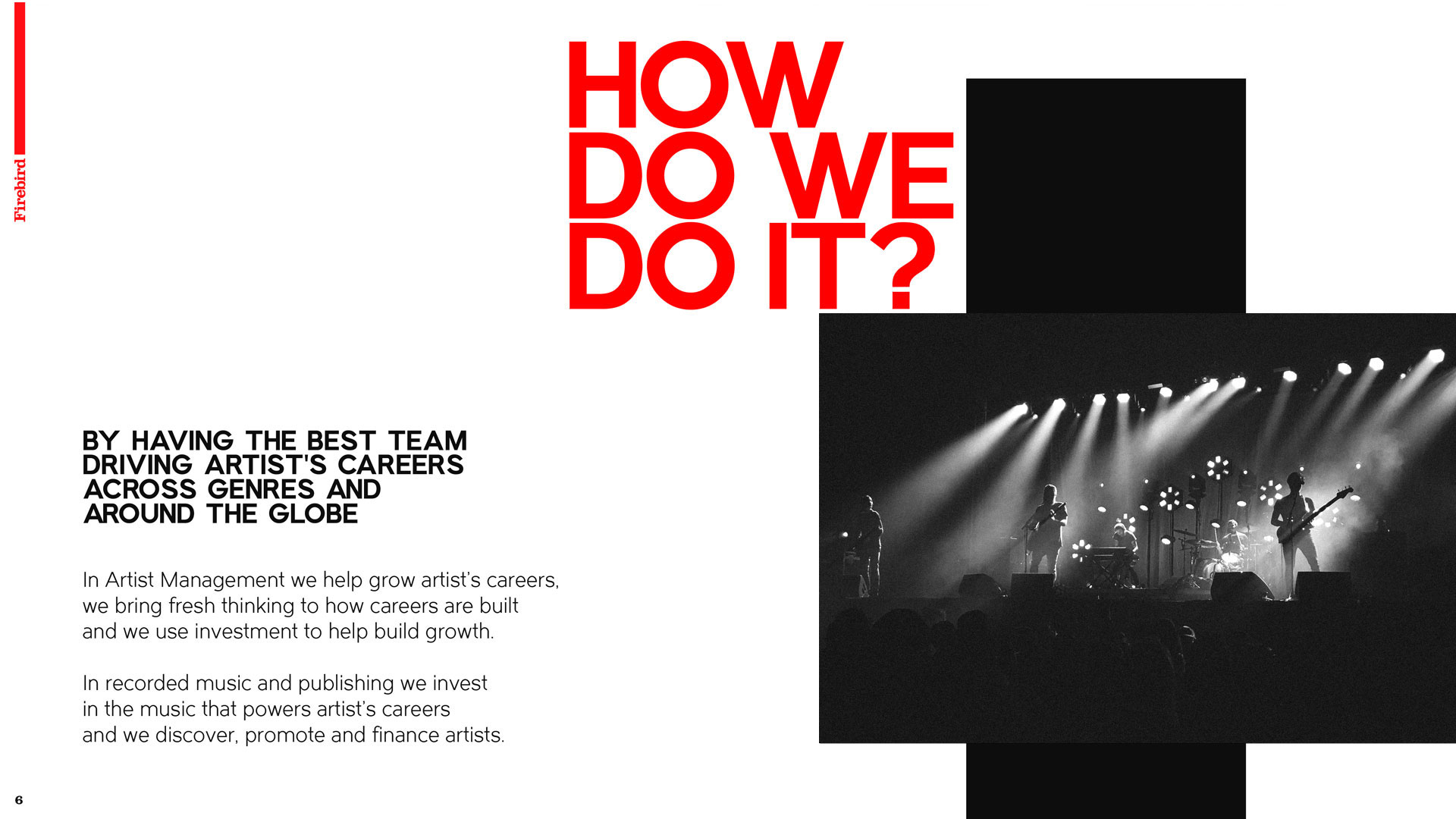
Los Angeles based Firebird, takes a more holistic approach to artist management. The idea is to remove the record company as the ‘primary organiser’ of a musicians career and replace that with the idea the musicians will become ‘Brand Creators’ that will operate in many other areas than music recording. Inspiring and empowering artists to navigate their own pathways. Placing ‘Artists Above All’.
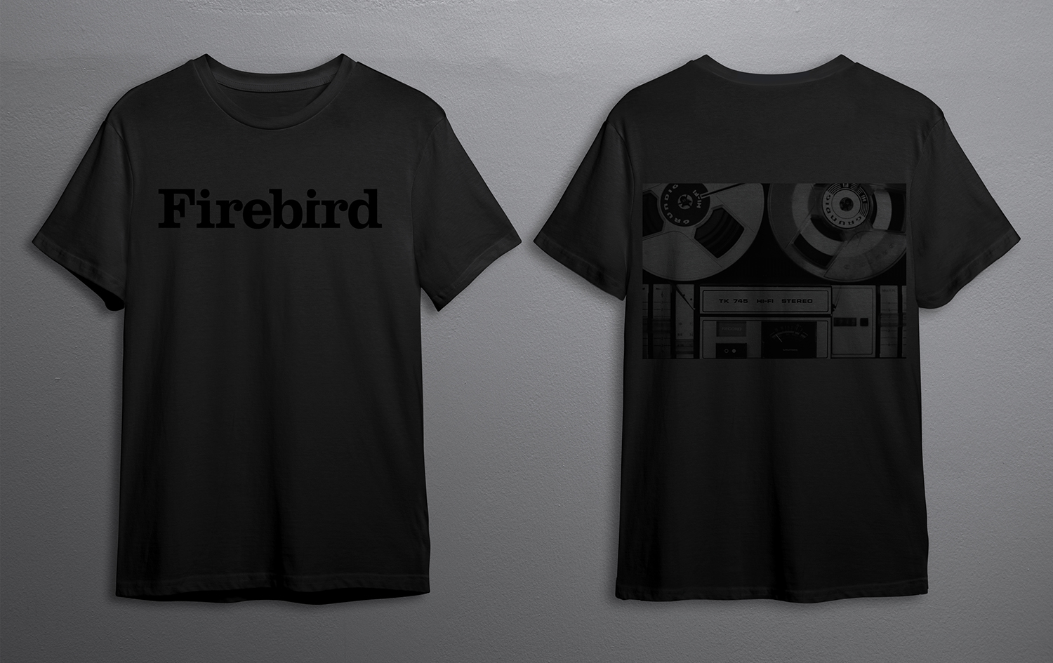
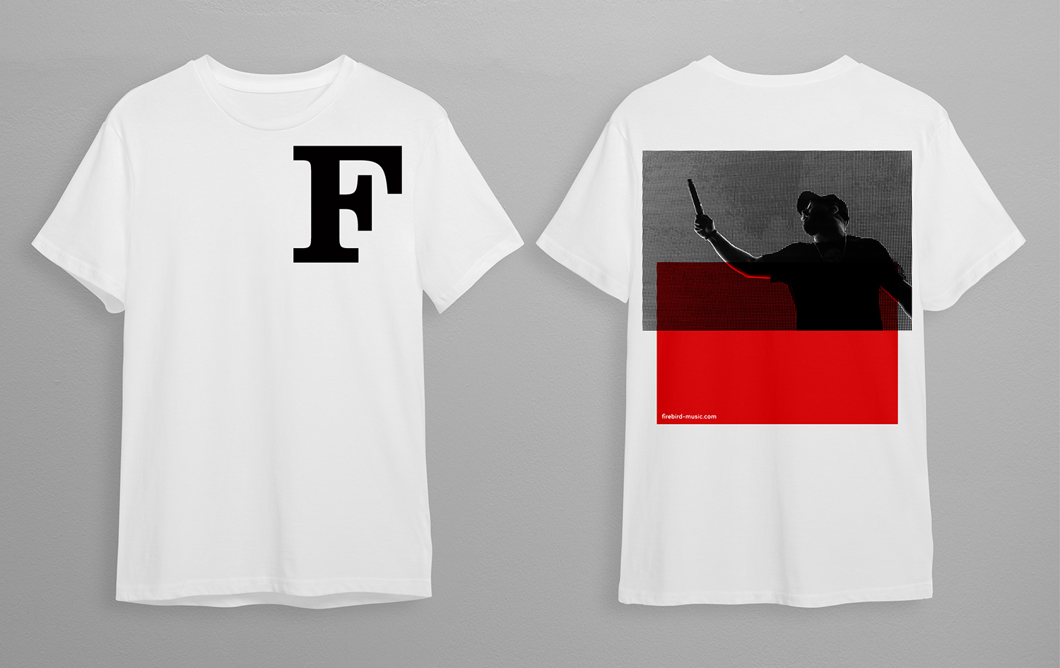
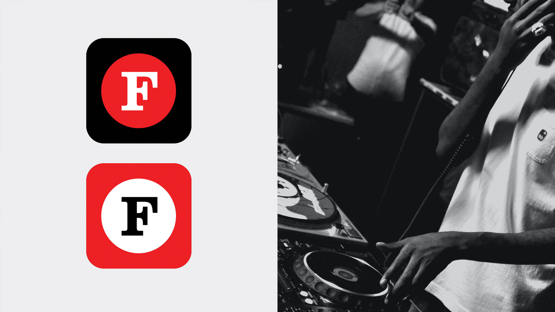
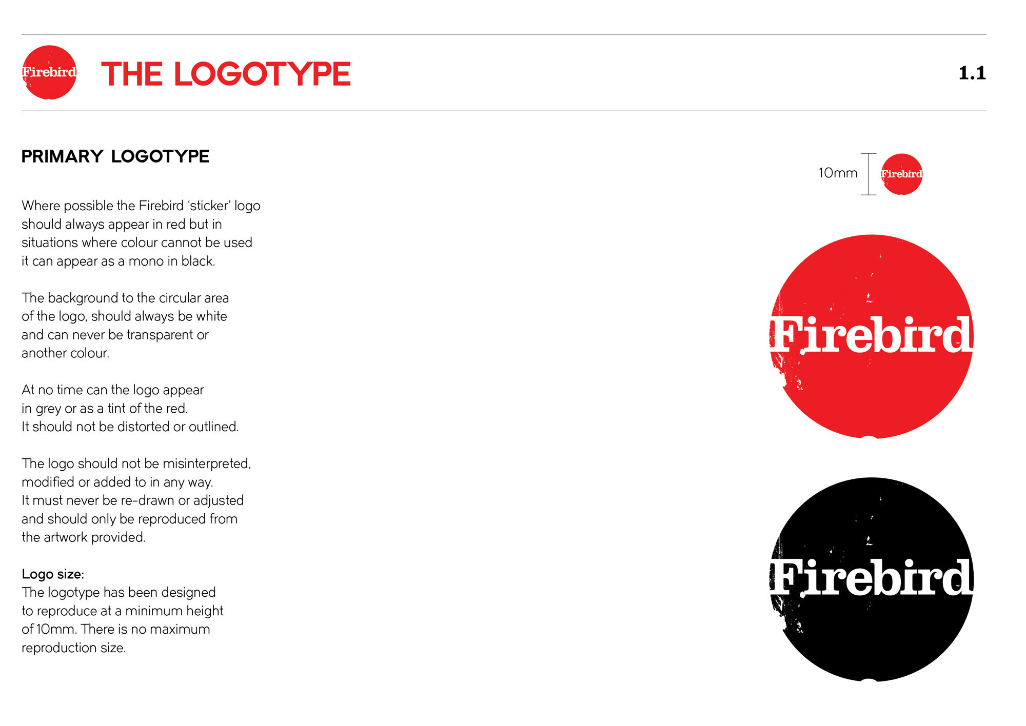
The challenge was to create two logotypes that function in both the business and artistic world. Representing the two sides of the company yet would seamlessly integrate, visually defining the brand. Exploring the music visual language of flight cases, DJ record boxes and decorated laptops, we took a more crafted approach to the primary logo, experimenting with ripped and torn paper to create a worn sticker style logotype. At the heart we honed a bold slab serif font that has a distinctly clear and legible visibility. The typeface is then taken out of the holding shape to create a cleaner secondary logotype.
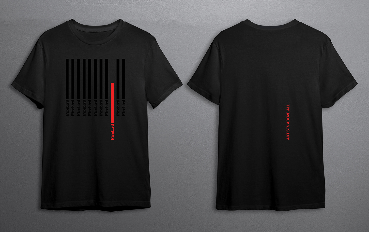
A bold colour palette of red, black and white compliments the primary choice of black and white photography, enhancing the authentic feel.
We developed a variety of collateral and merchandising items including T-shirts and baseball caps through to a comprehensive set of brand guidelines, marketing decks and in-house documentation along with digital elements.
Client: Firebird Music


© 2026 Teller Creative. All rights reserved.
Website design by ACRE
Website design by ACRE
© 2026 Teller Creative. All rights reserved.
