
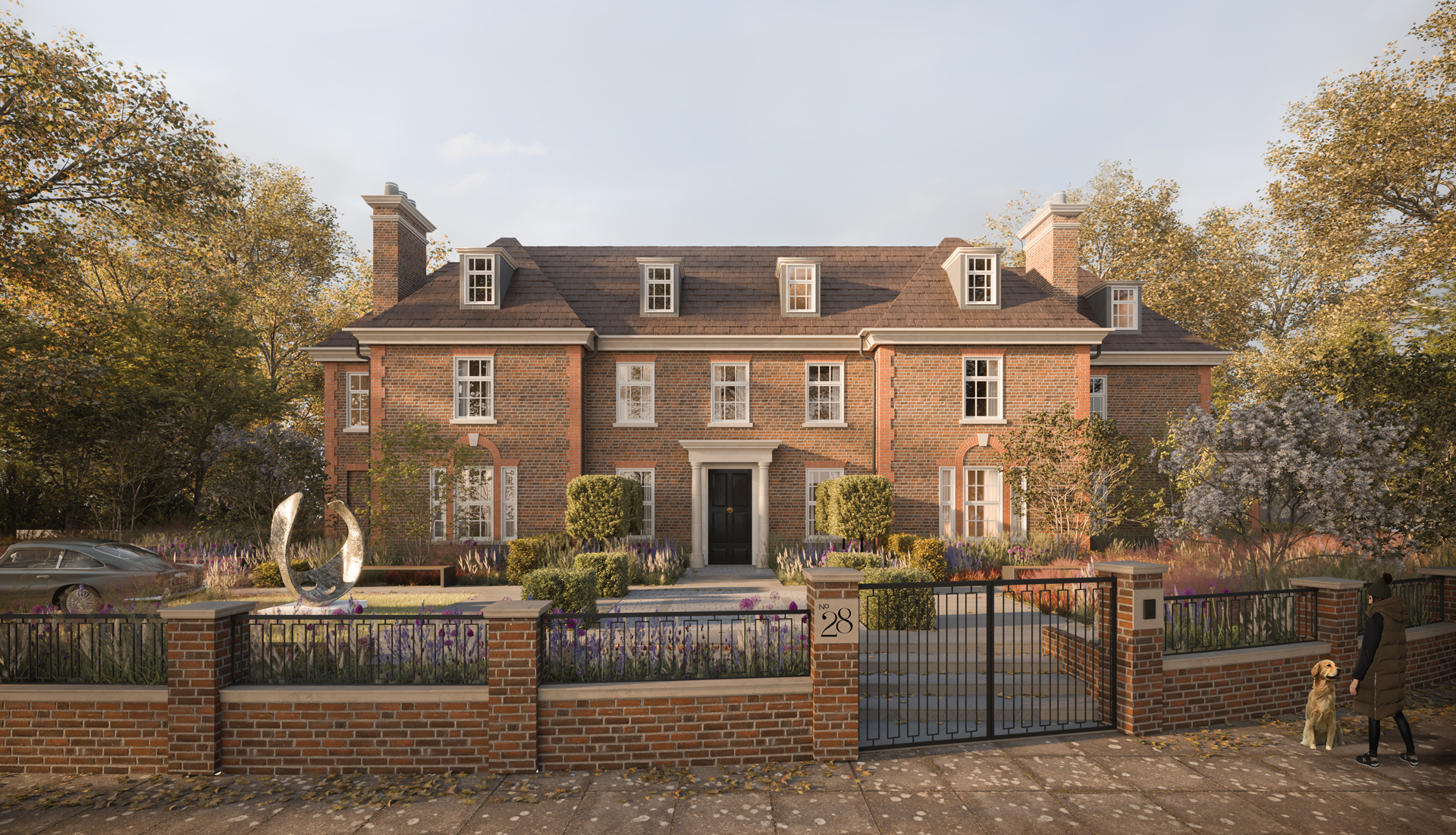
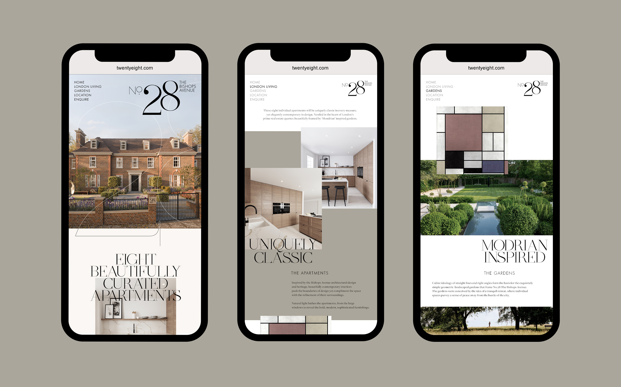
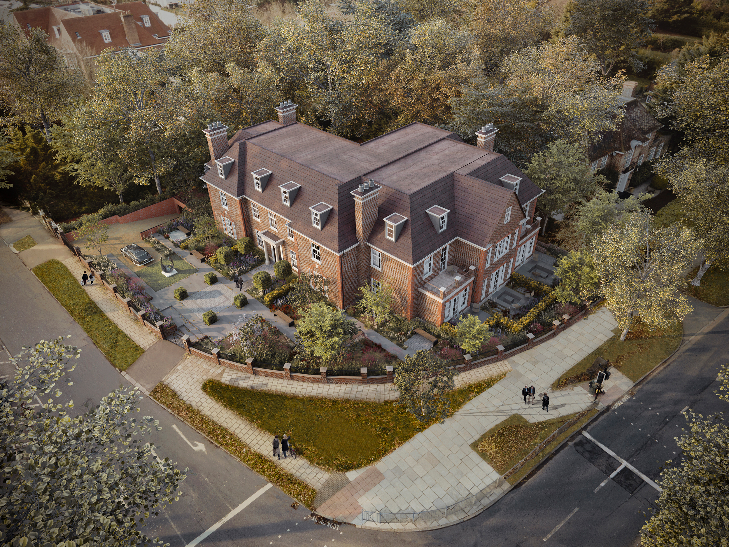
We were approached by a private family who’s heritage in The Bishops Avenue is illustrious, to create the brand identity and deliver all the marketing materials for this masterpiece of contemporary living.
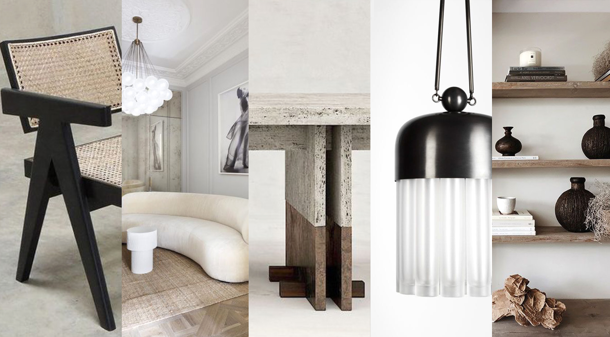
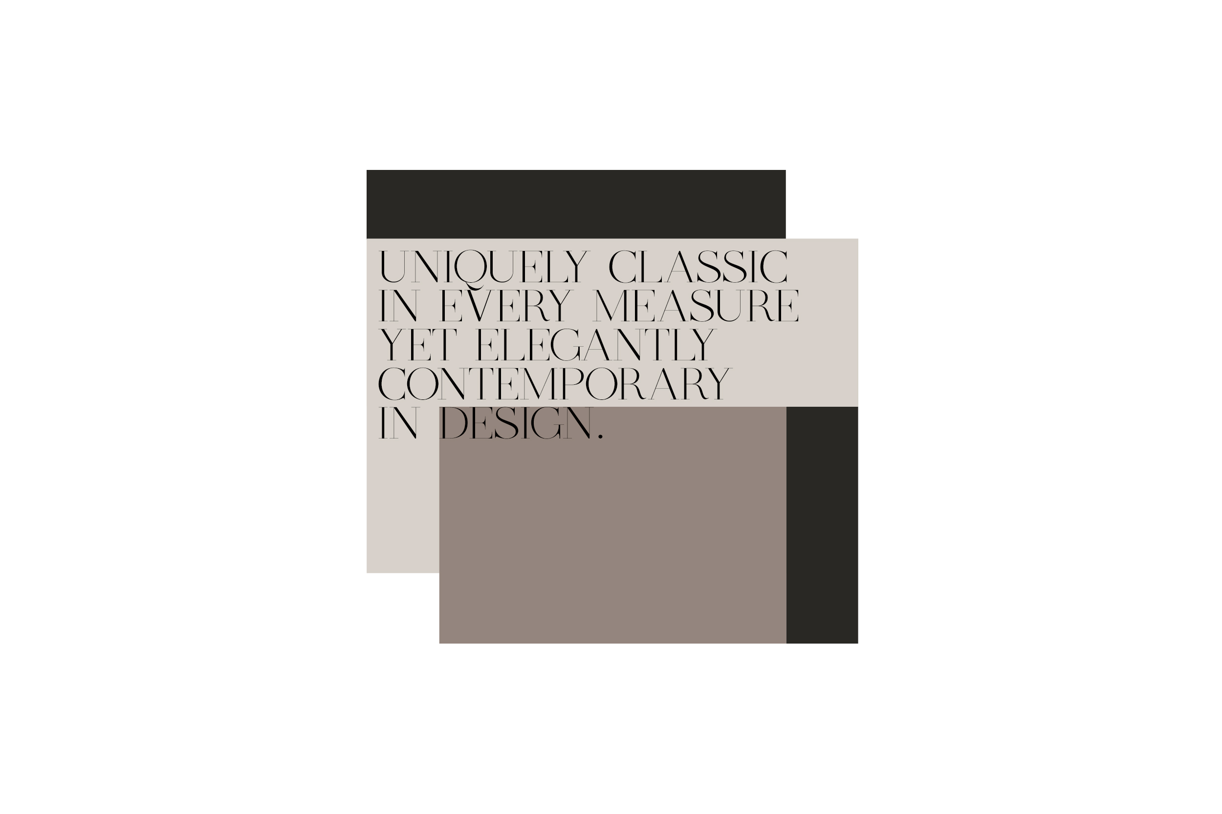
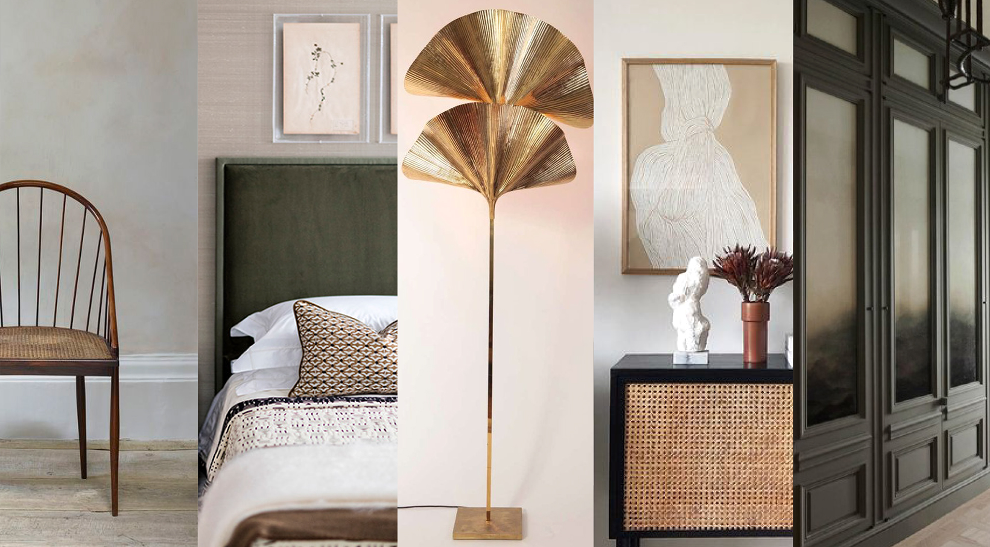
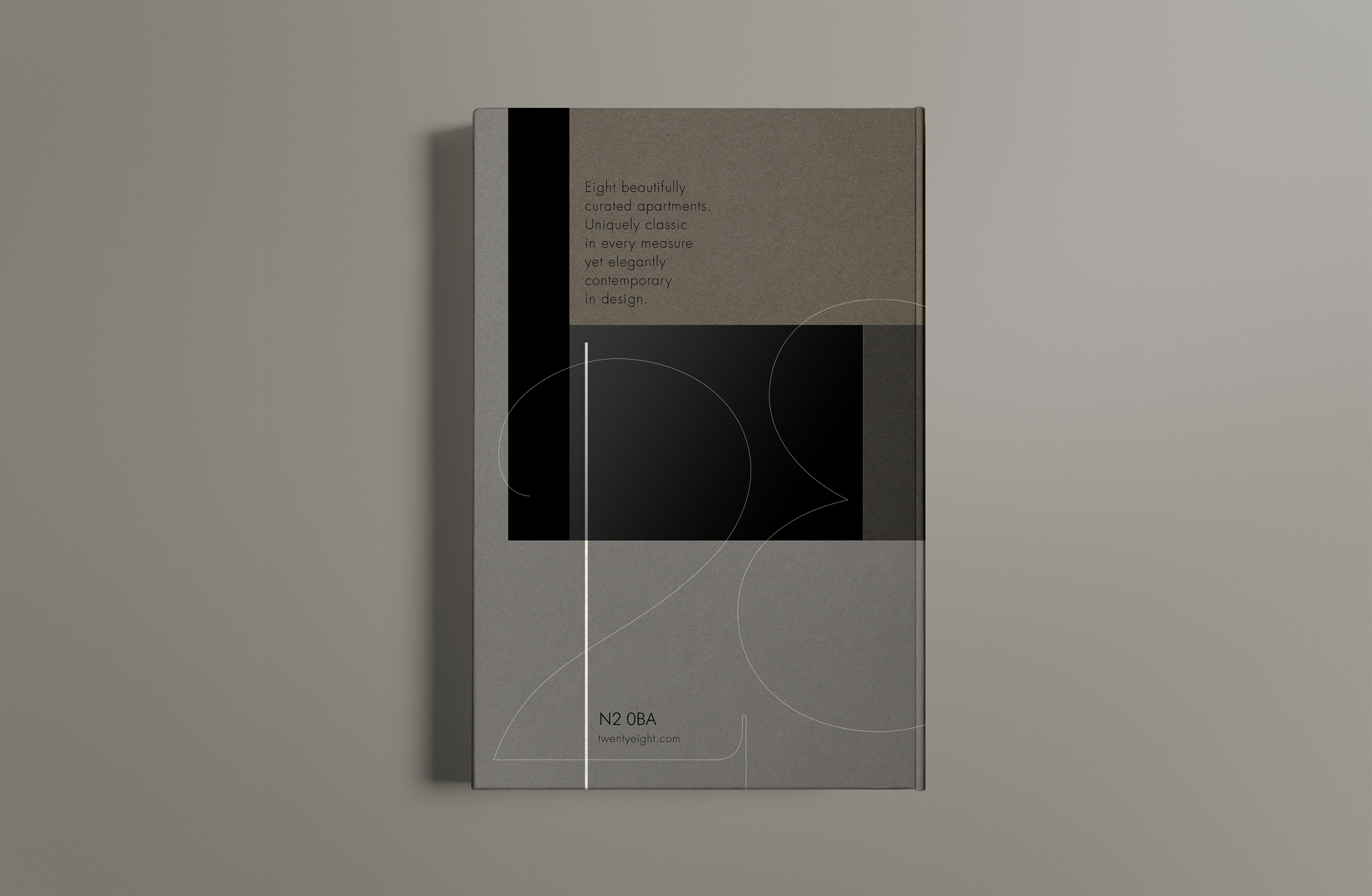
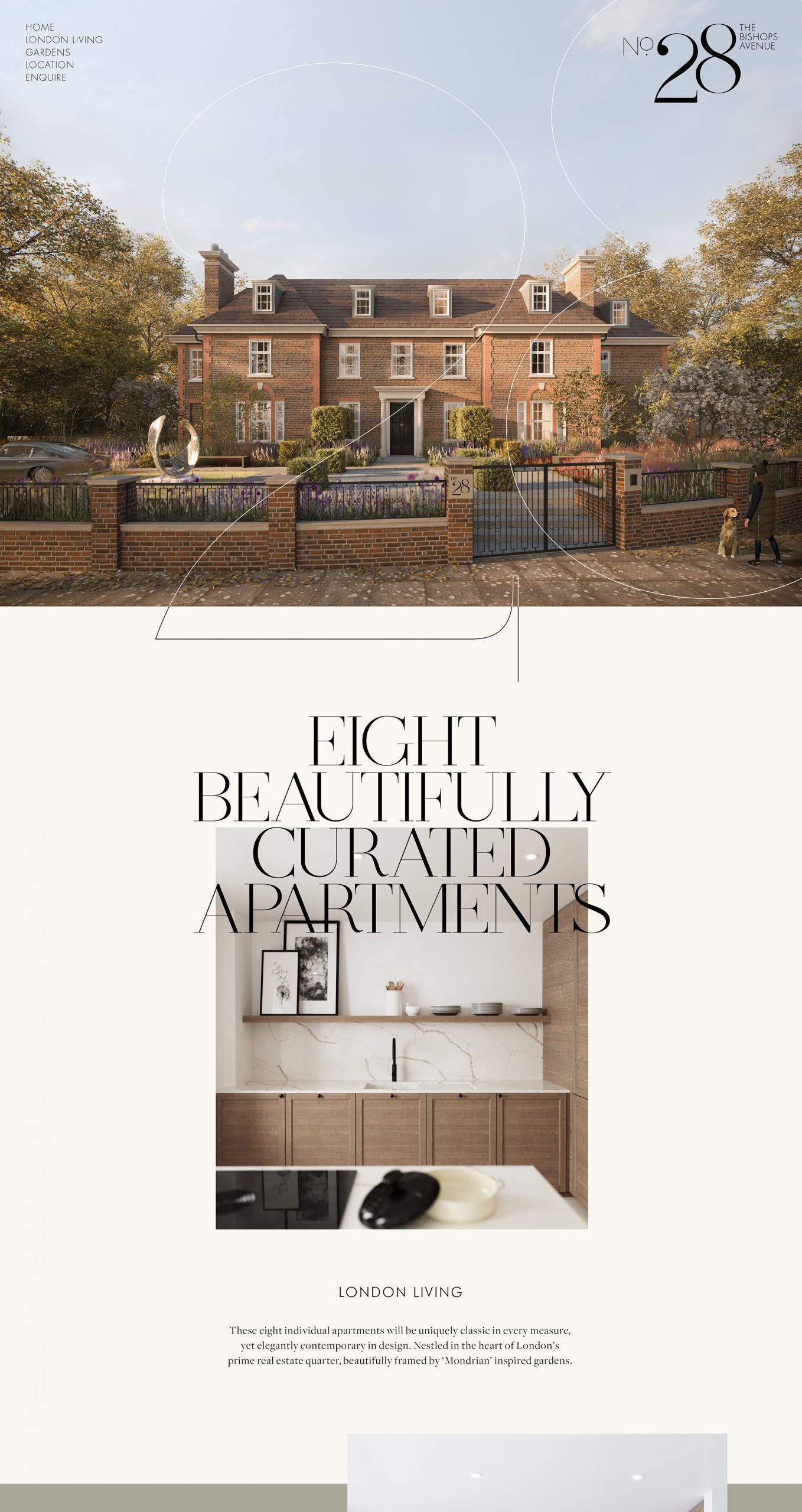
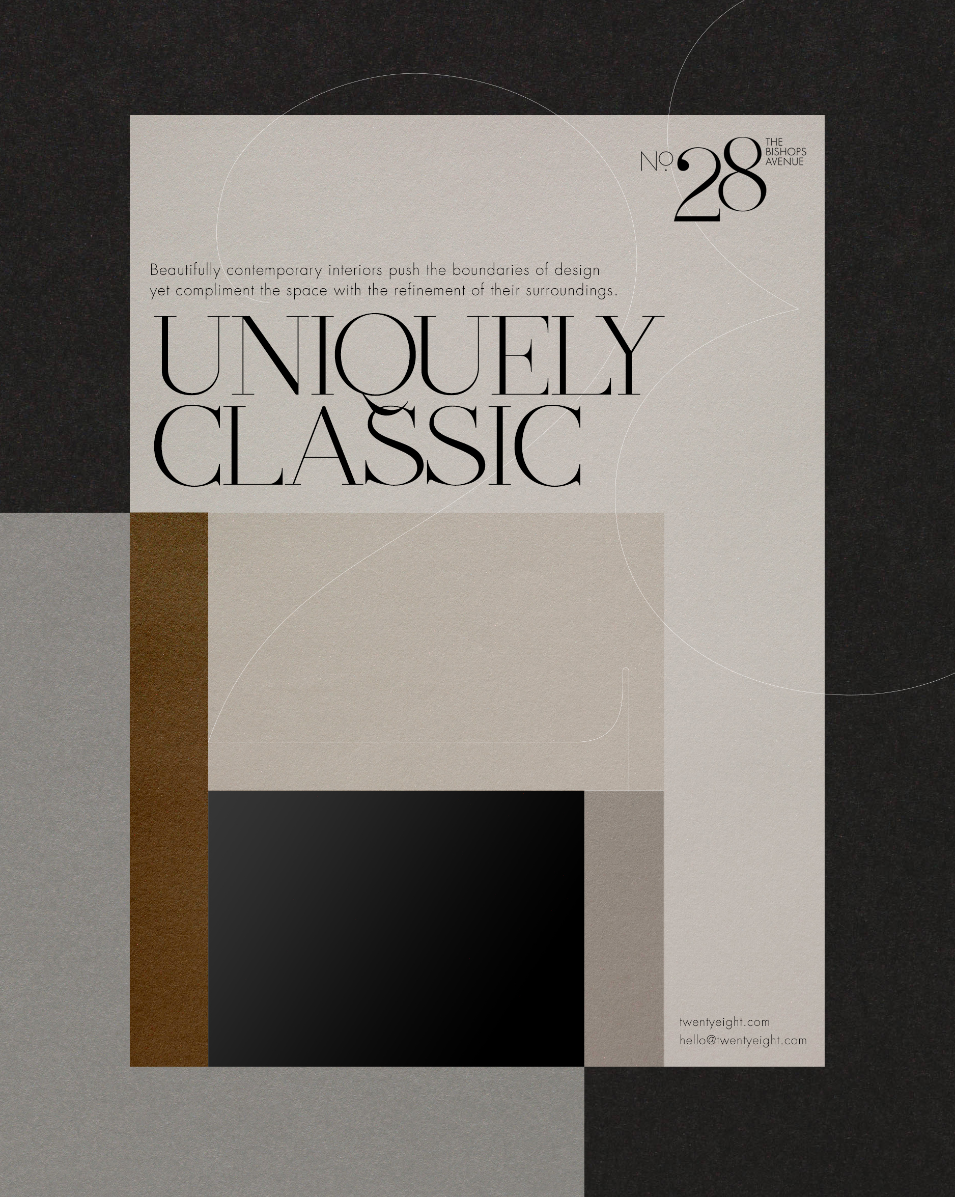
These eight individual apartments will be uniquely classic in every measure, yet elegantly contemporary in design. Nestled in the heart of London’s prime real estate quarter, beautifully framed by ‘Mondrian’ inspired gardens.
The typographical style of the logomark is beautifully crafted with a modern edge. Suggesting a certain level of elegance, quality and creativity. It takes its inspiration from the traditional ‘London Style’ house numbers which adorned the early aristocratic homes of the early 1800’s.
Communicating the building’s history and legacy, its extraordinary location and exclusive nature. To be at No.28 The Bishops Avenue is to be in the best company.
Client: Private Family Office


© 2026 Teller Creative. All rights reserved.
Website design by ACRE
Website design by ACRE
© 2026 Teller Creative. All rights reserved.
